🍒


Lubriderm Life-Tested. Essential.
Brand Identity, Design System, PACKAGING, eComm, Digital, SOCIAL
overview
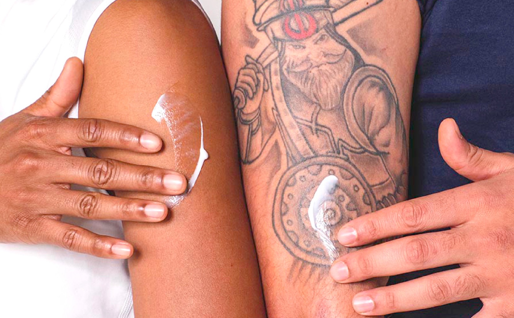
Lubriderm is a classic. Nearly everyone in the US has a connection with the brand. Bathroom cabinets. Car dashboards. Hospital dispensers. Tattoo studios. A household staple since 1975, Lubriderm earned its place through a dermatologically developed formula trusted across all skin types — and kept it for decades without advertising.
A classic. And one that hadn't been updated in nearly twenty years.

CHALLENGE
The brand's assets no longer reflected who actually used it. Airbrushed. Narrow. A design language that spoke to a fraction of the people it served. With no visual system, no social presence, and no way to show up coherently across modern touchpoints, Lubriderm needed more than a refresh — it needed a full brand build.
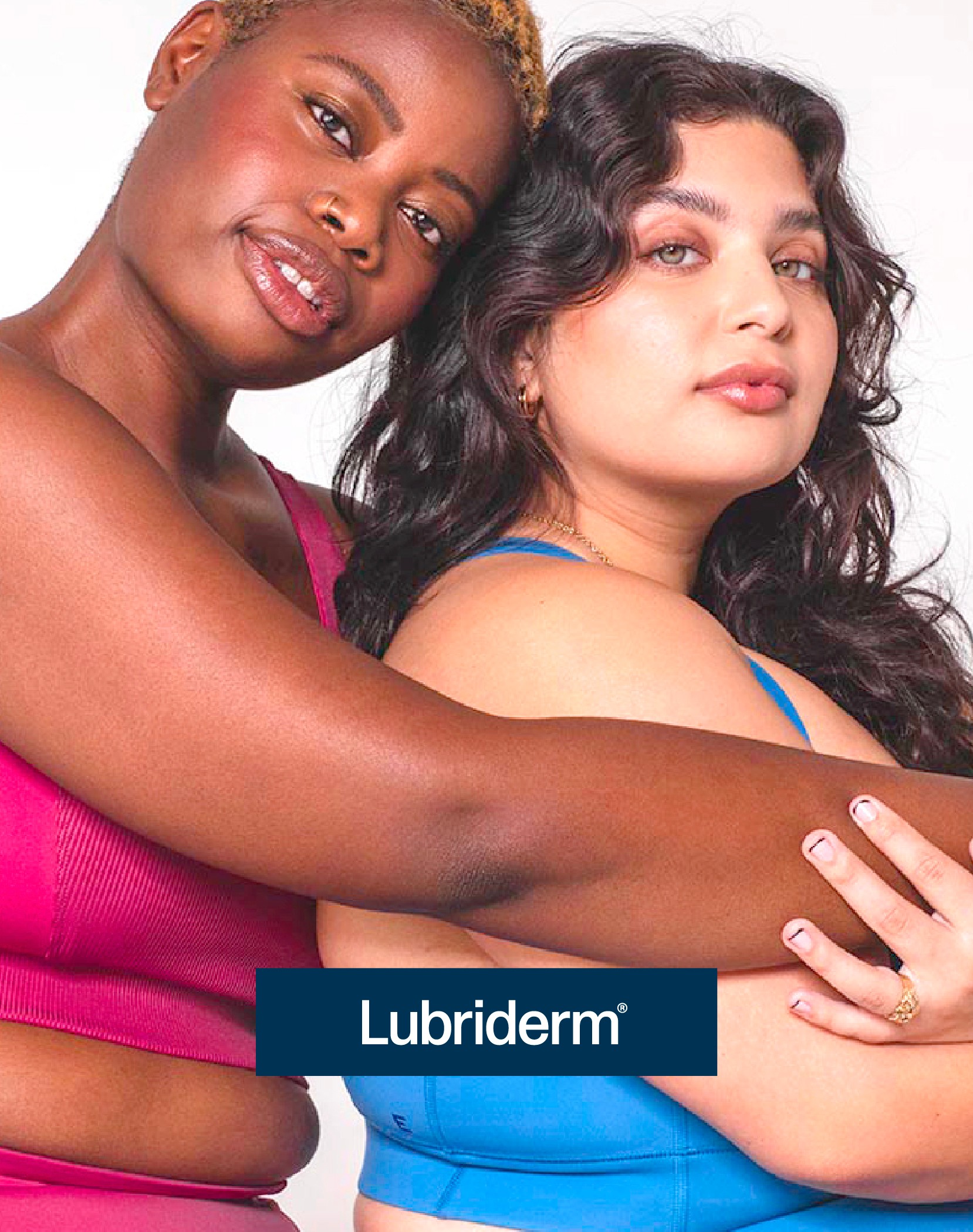
The brief: define the brand foundation and build assets that celebrate people of all shapes, sizes, and skin types.
STRATEGY
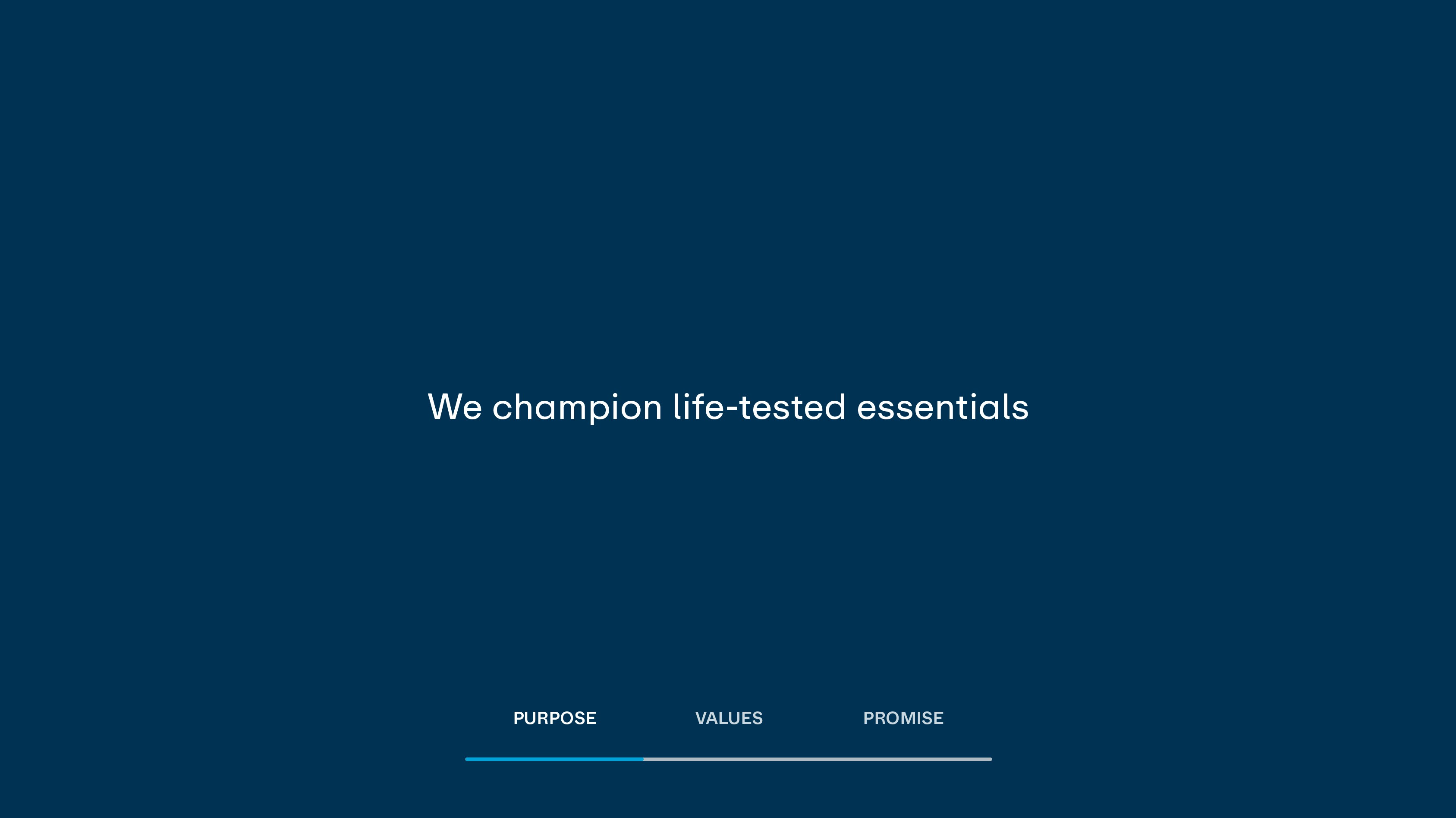
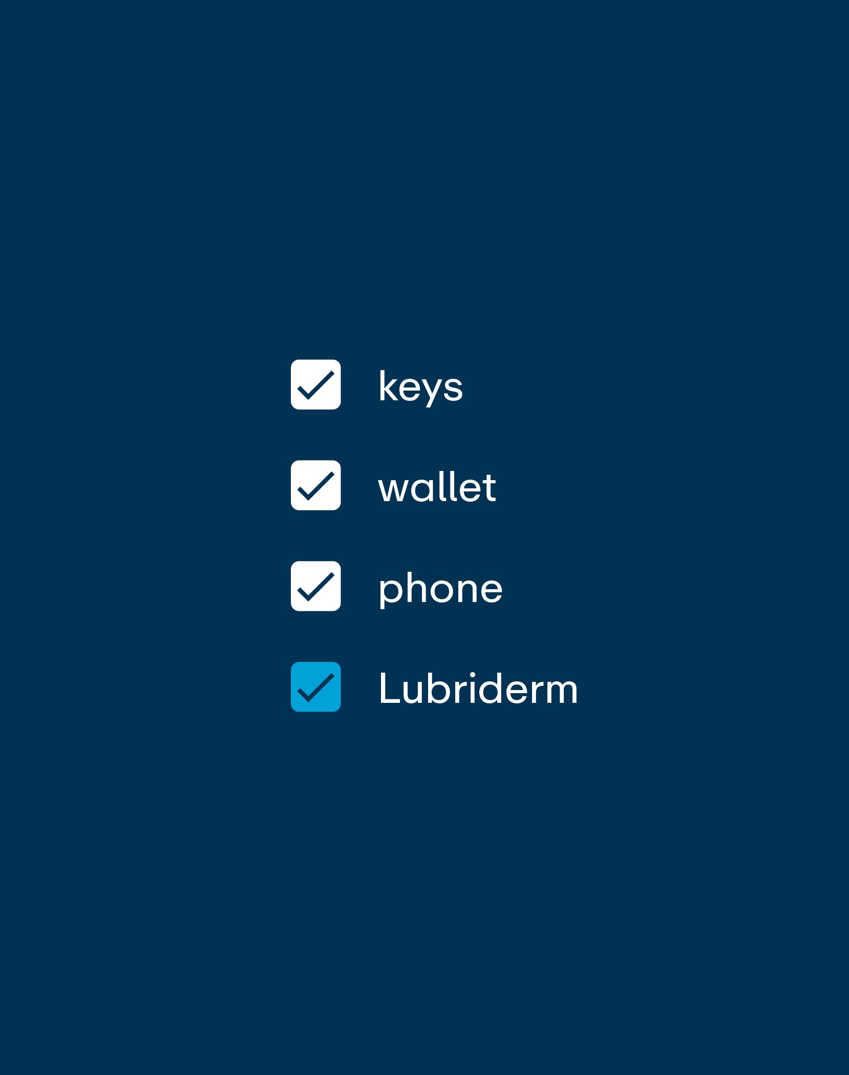
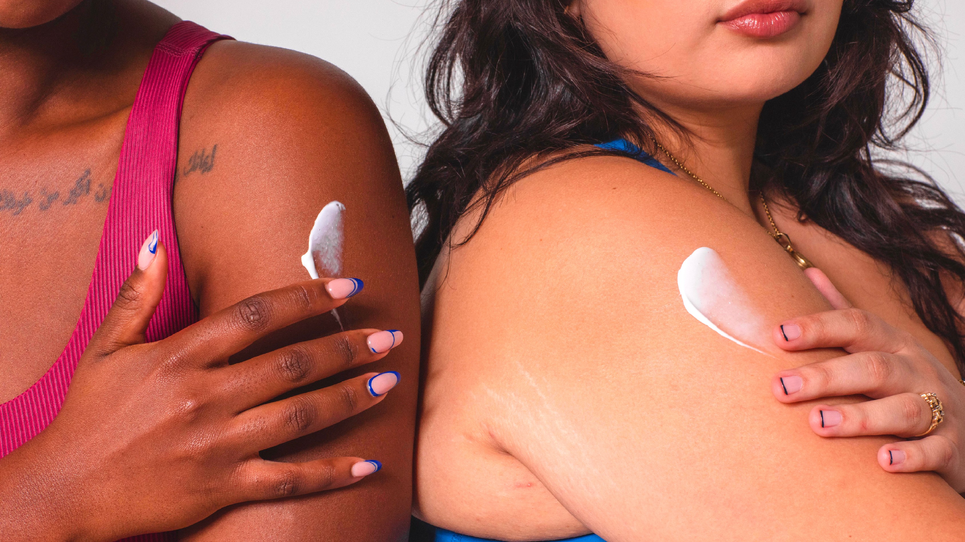
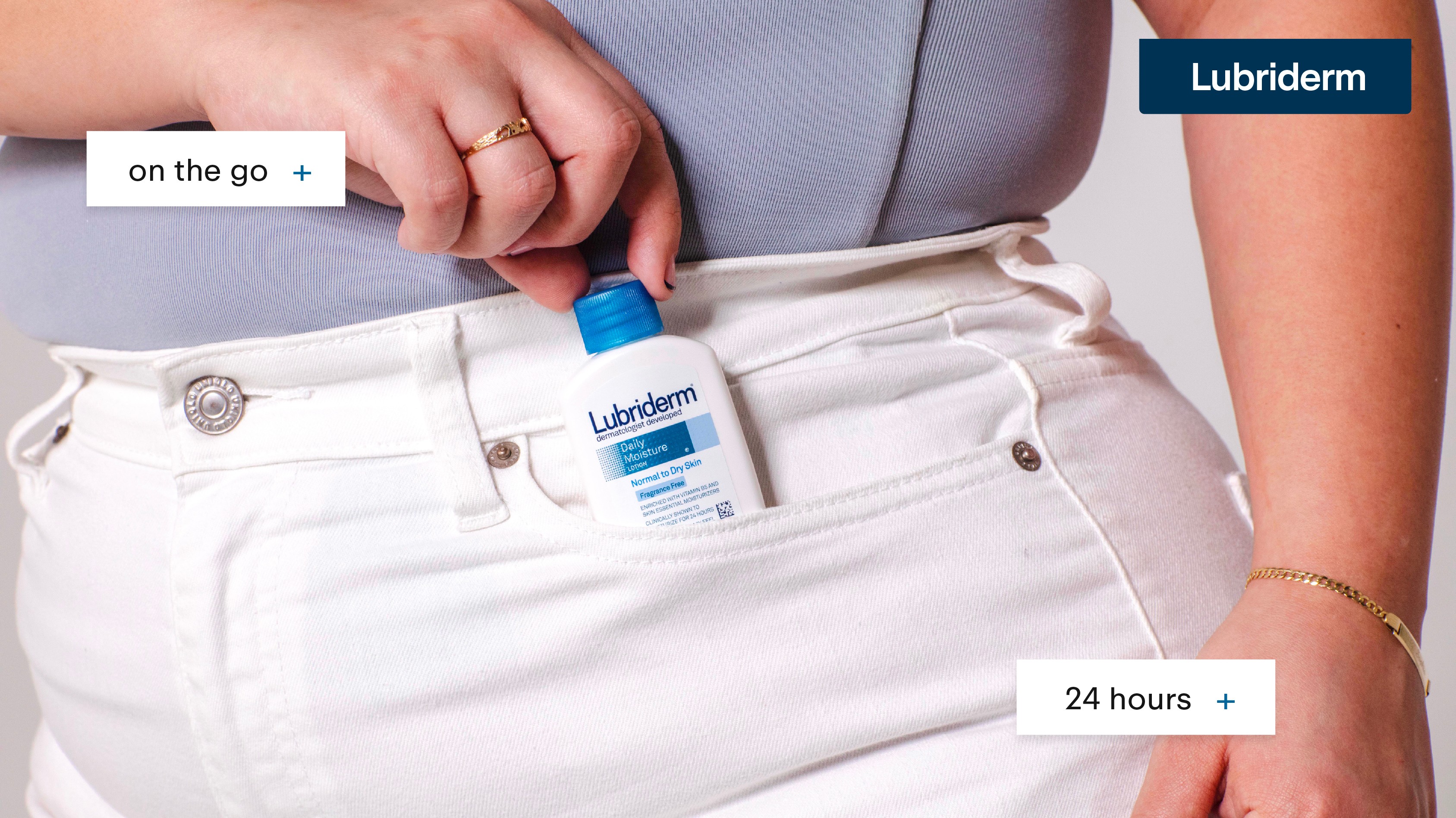
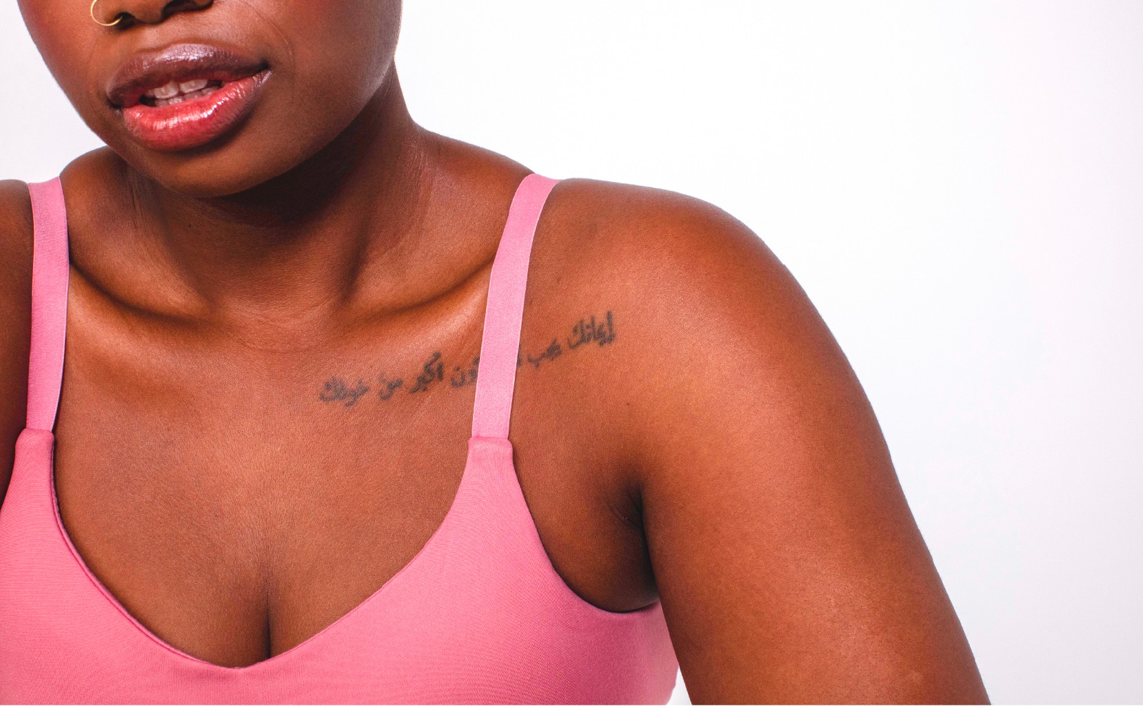
Lubriderm is an essential product, recommended for daily use. Not aspirational. Not transformational. Essential. So the strategy was simple: show skin — clean, real, everyday — in the myriad of ways Lubriderm actually shows up in life.
Simple. Classic. Consistent. Useful.

IDENTITY
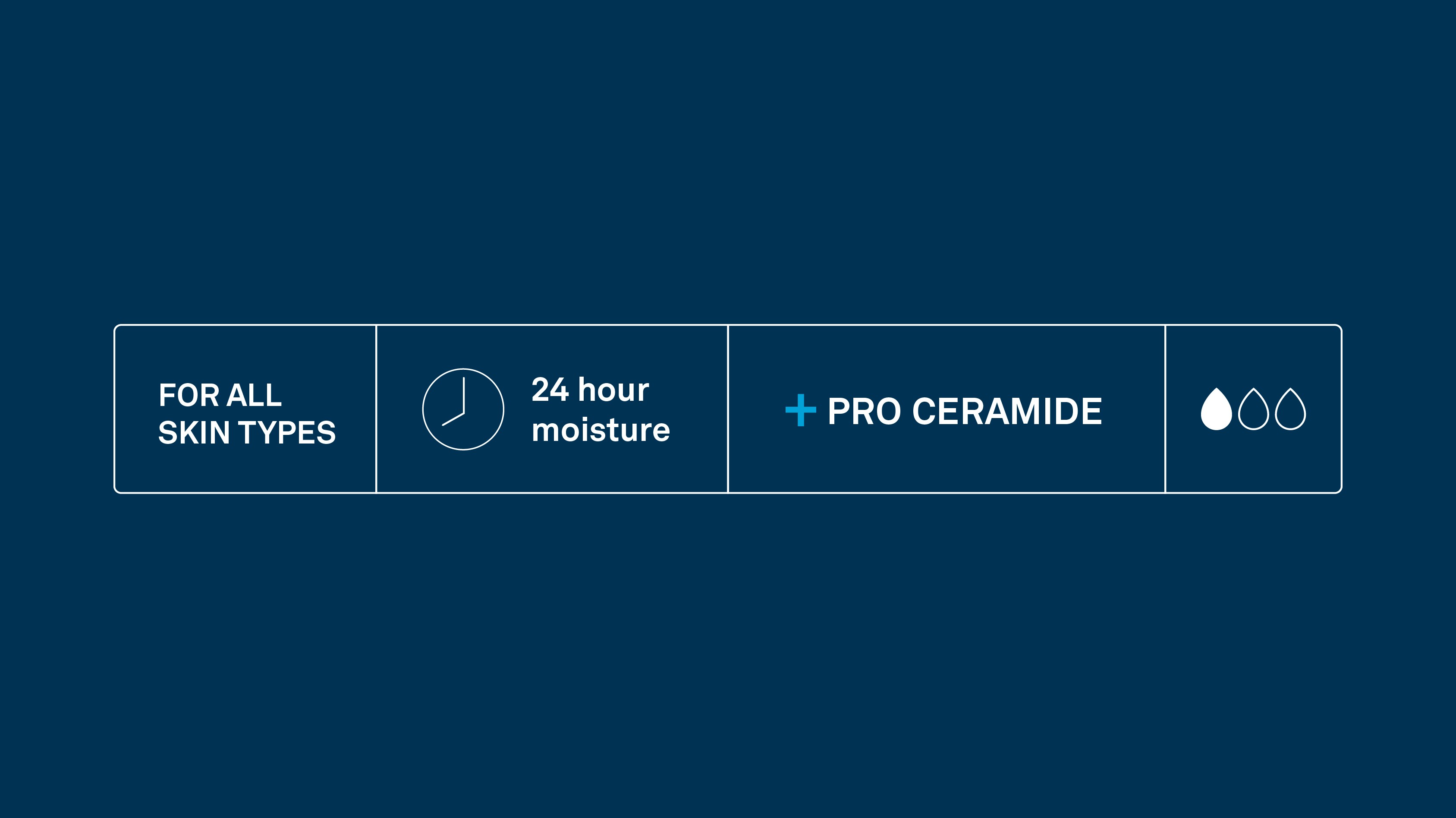
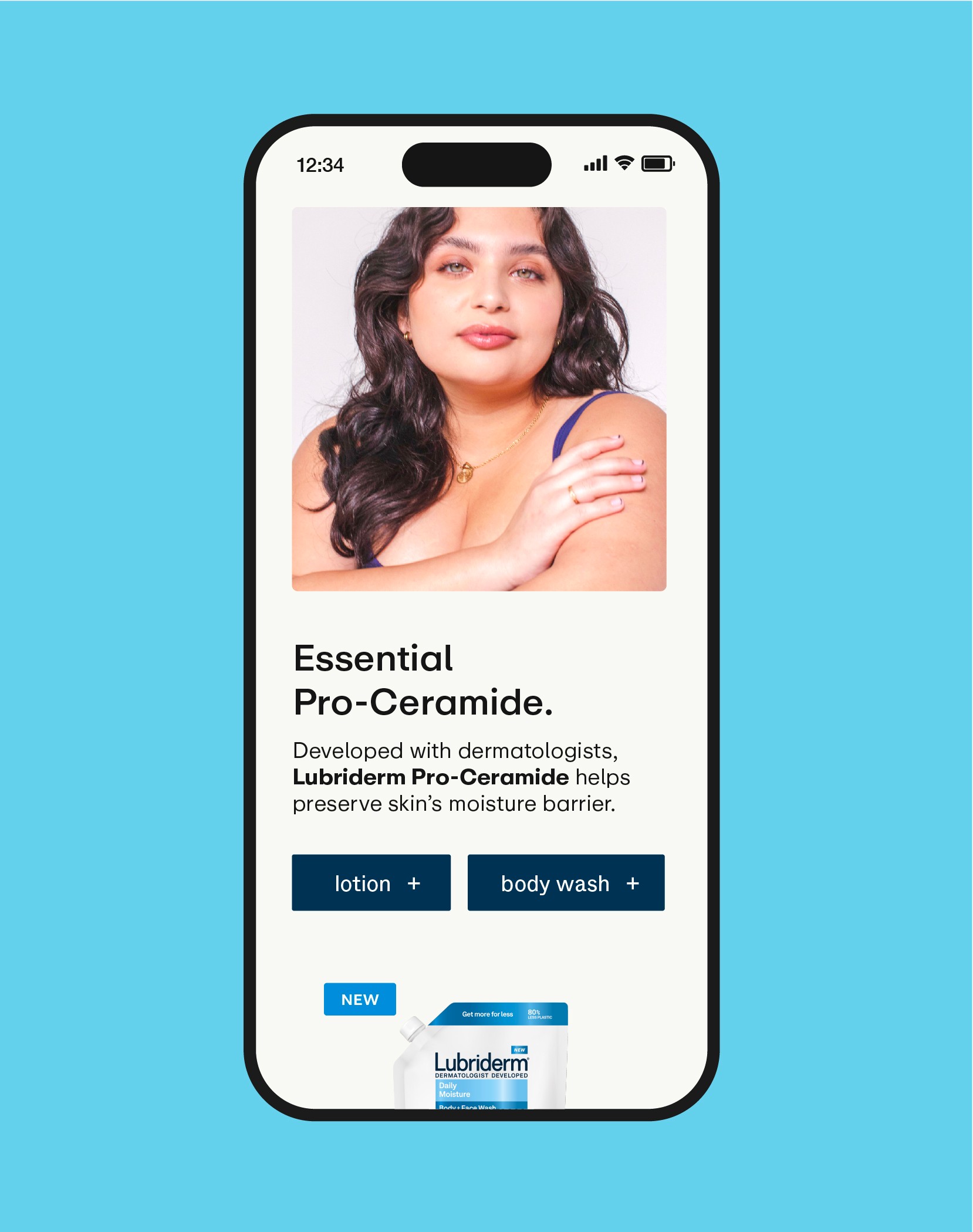
Designing for the essentialist means using only what's necessary. No fluff, no filler. Just people at the heart of the brand, and just enough structure to carry the benefits.
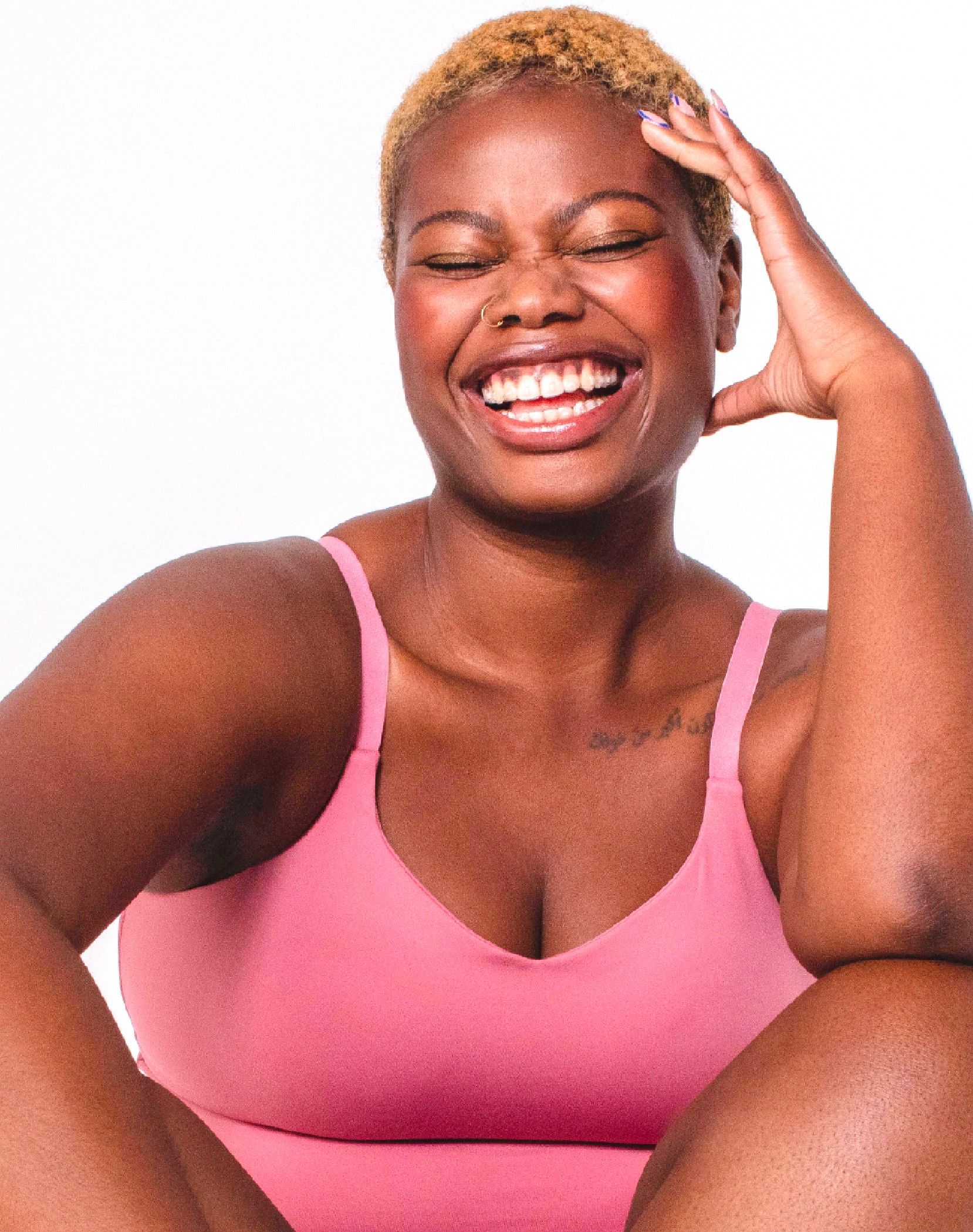
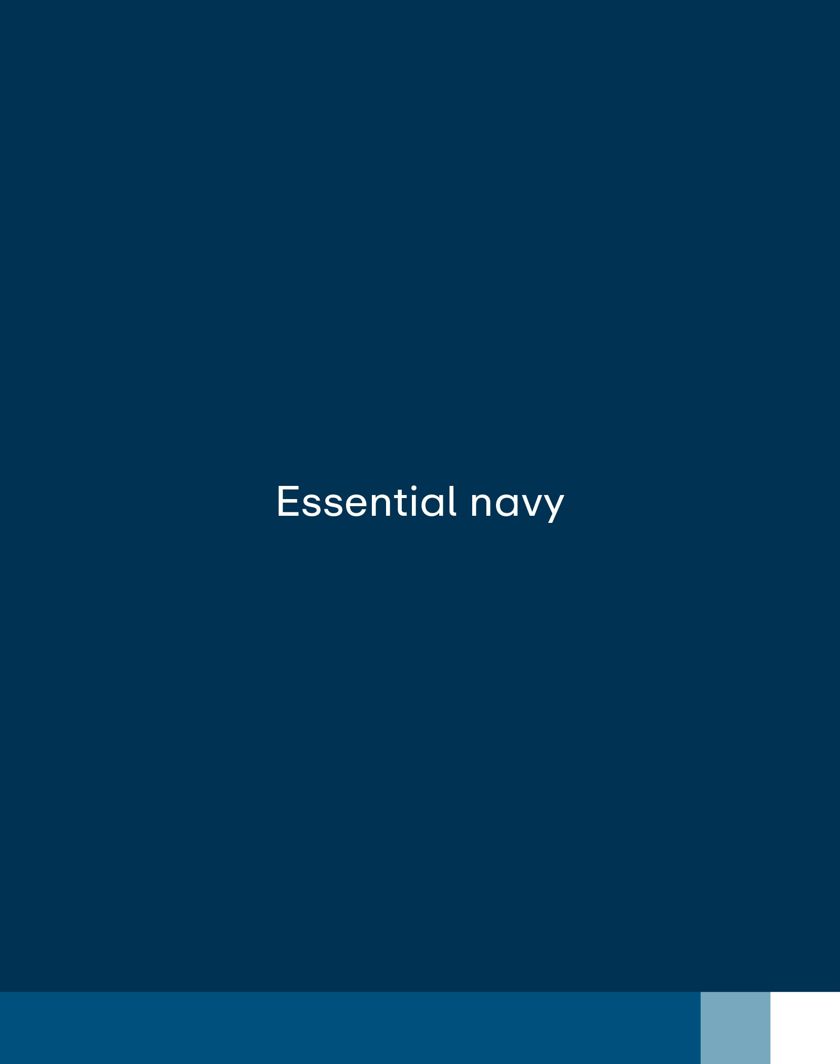
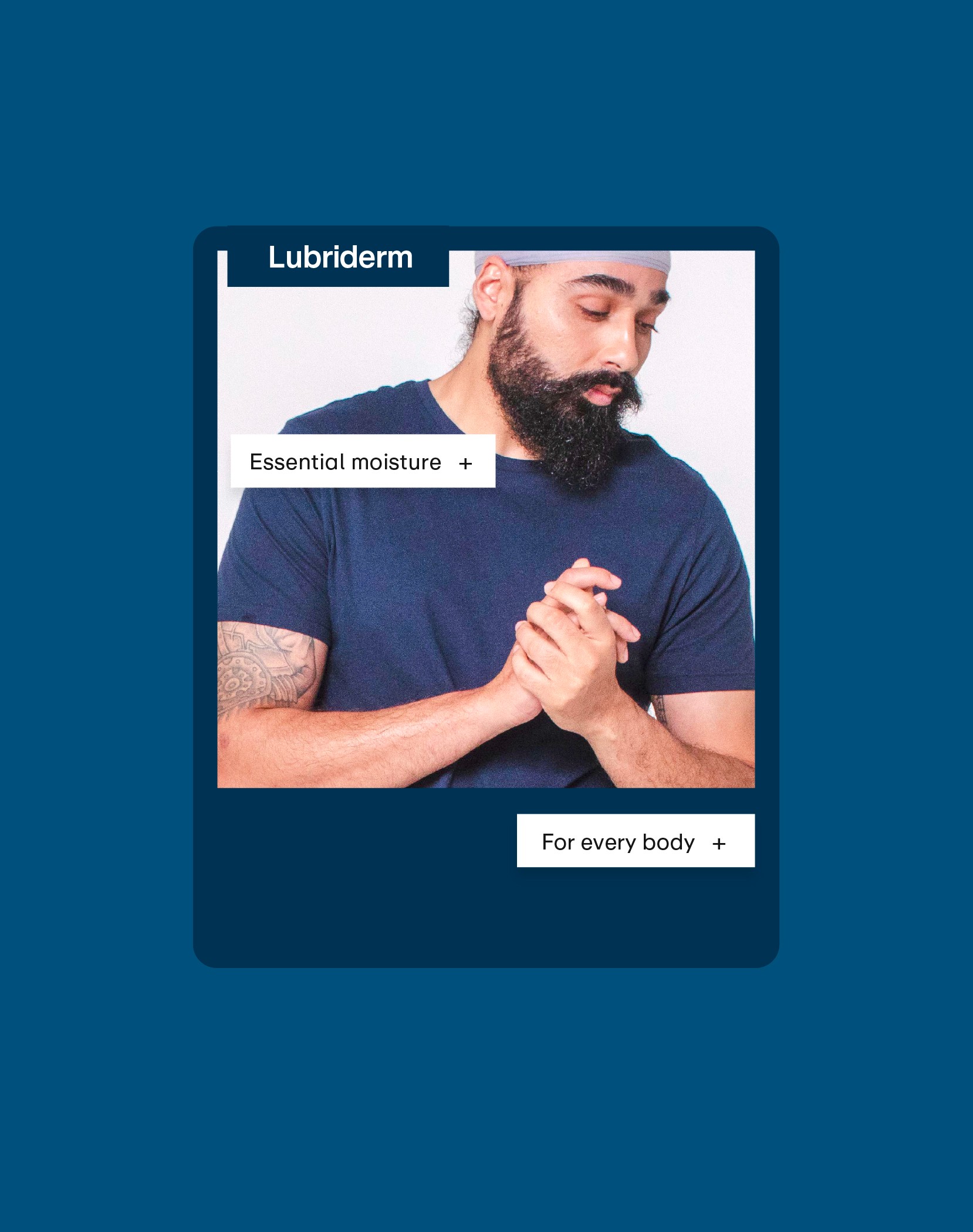
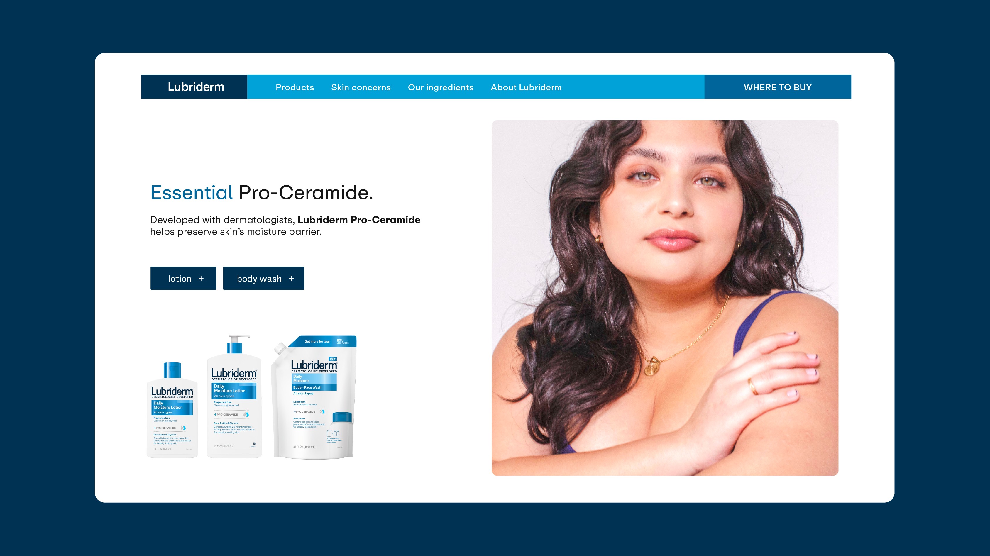
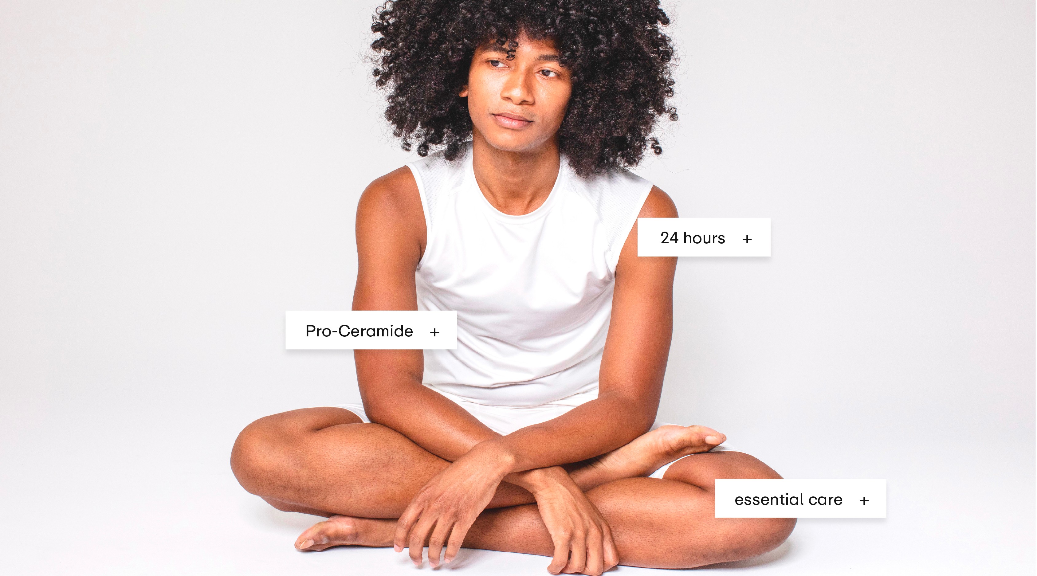
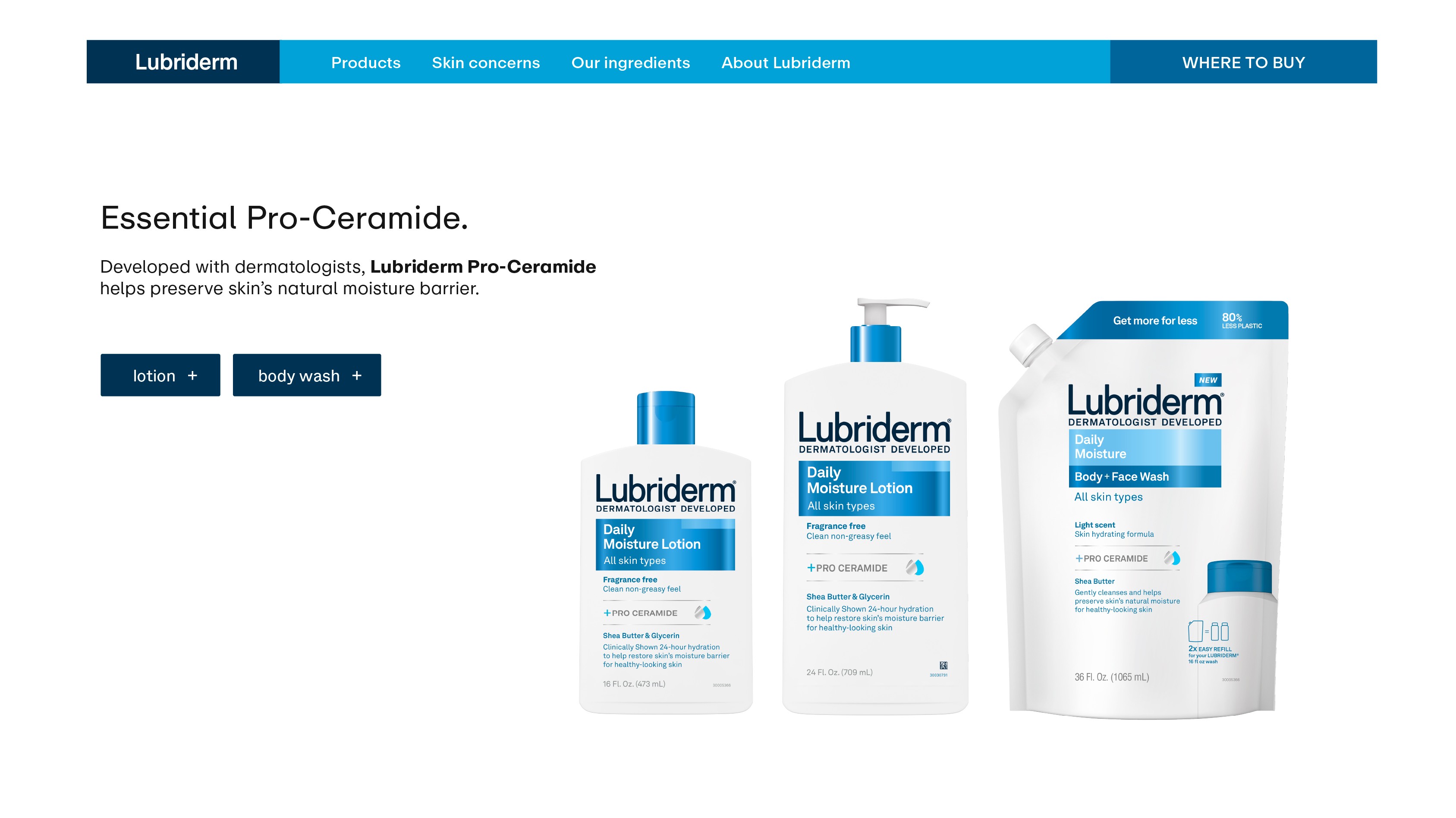
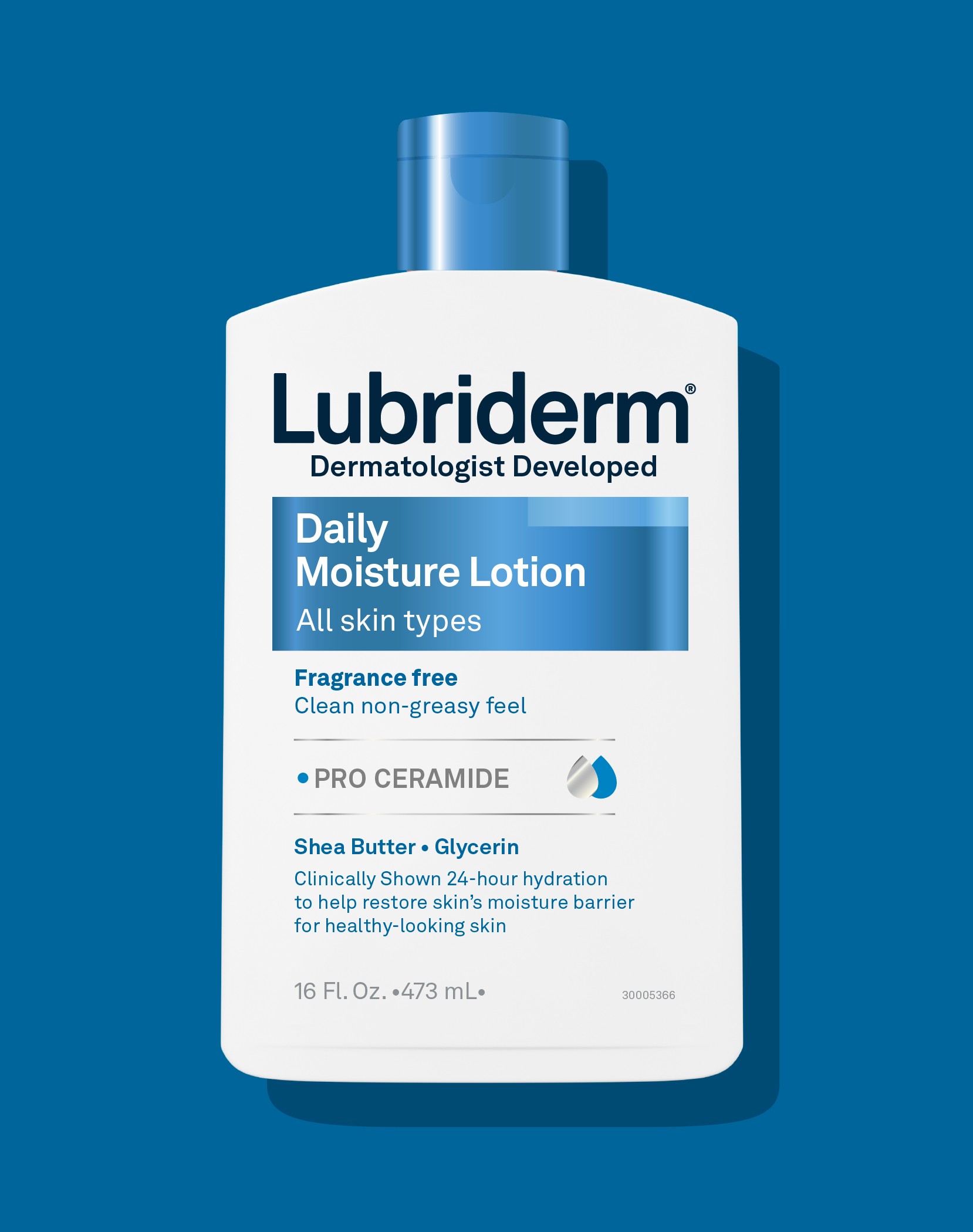
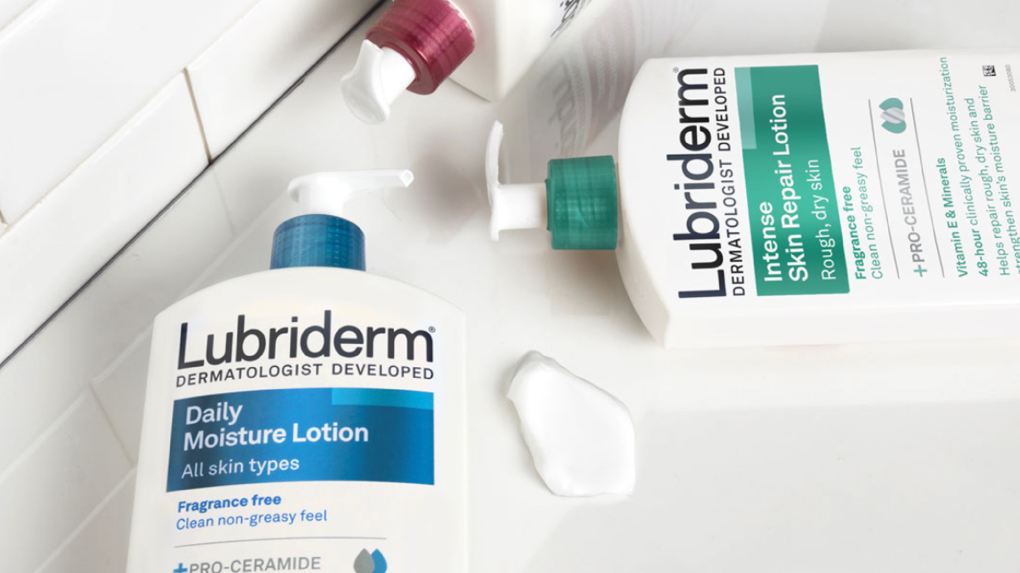
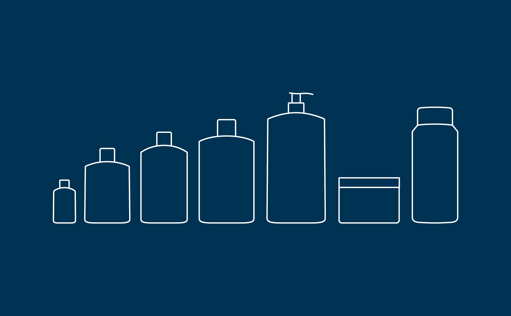
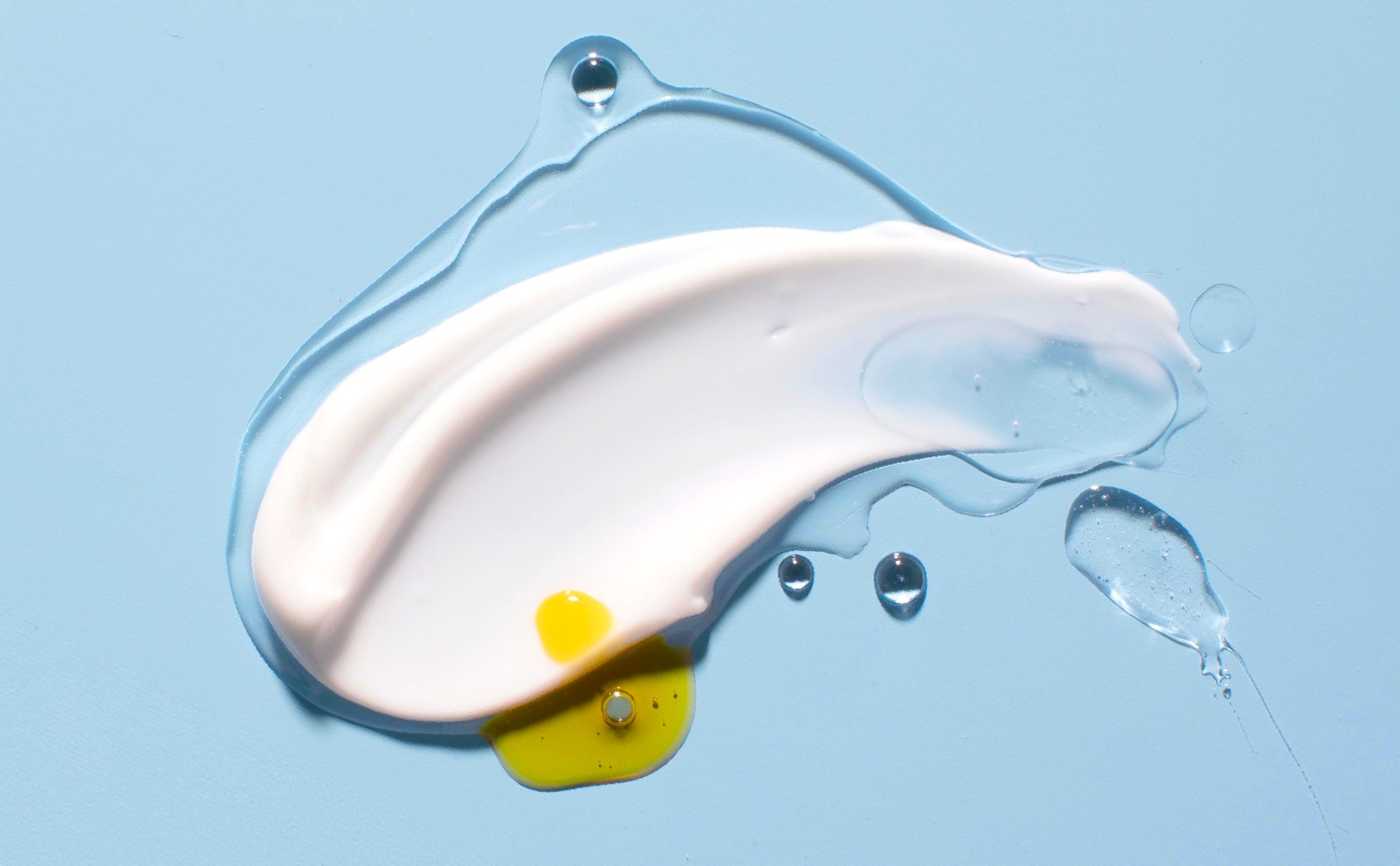
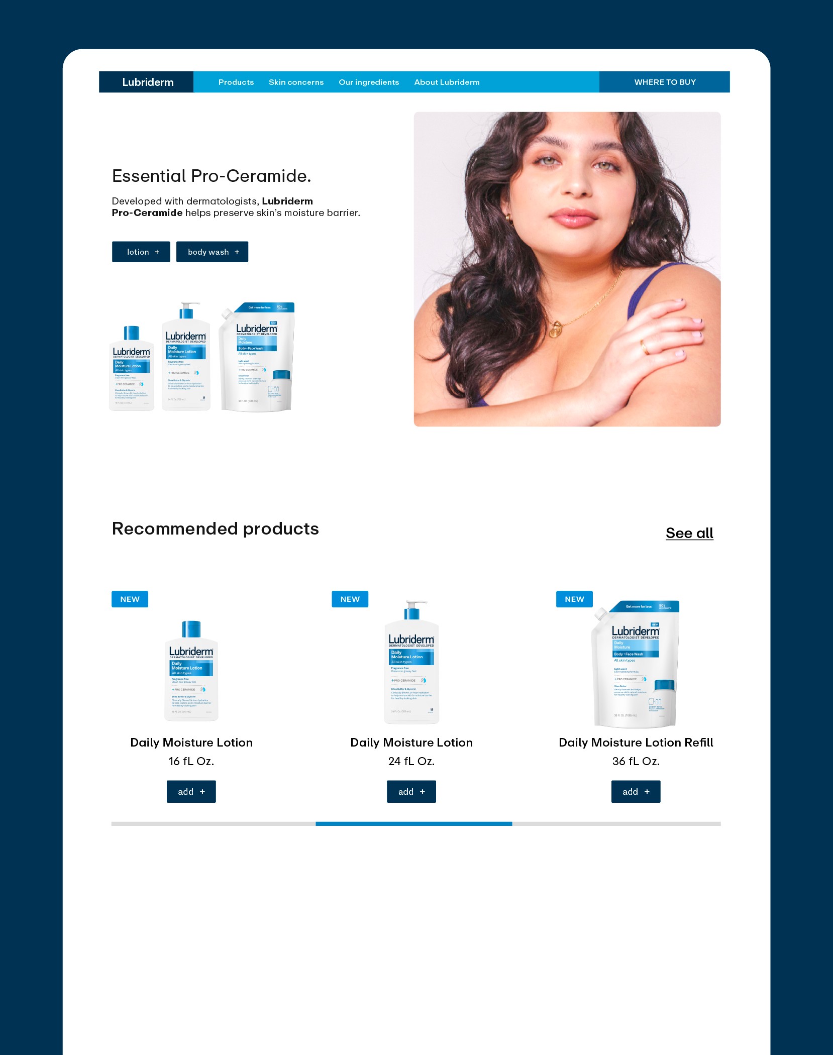
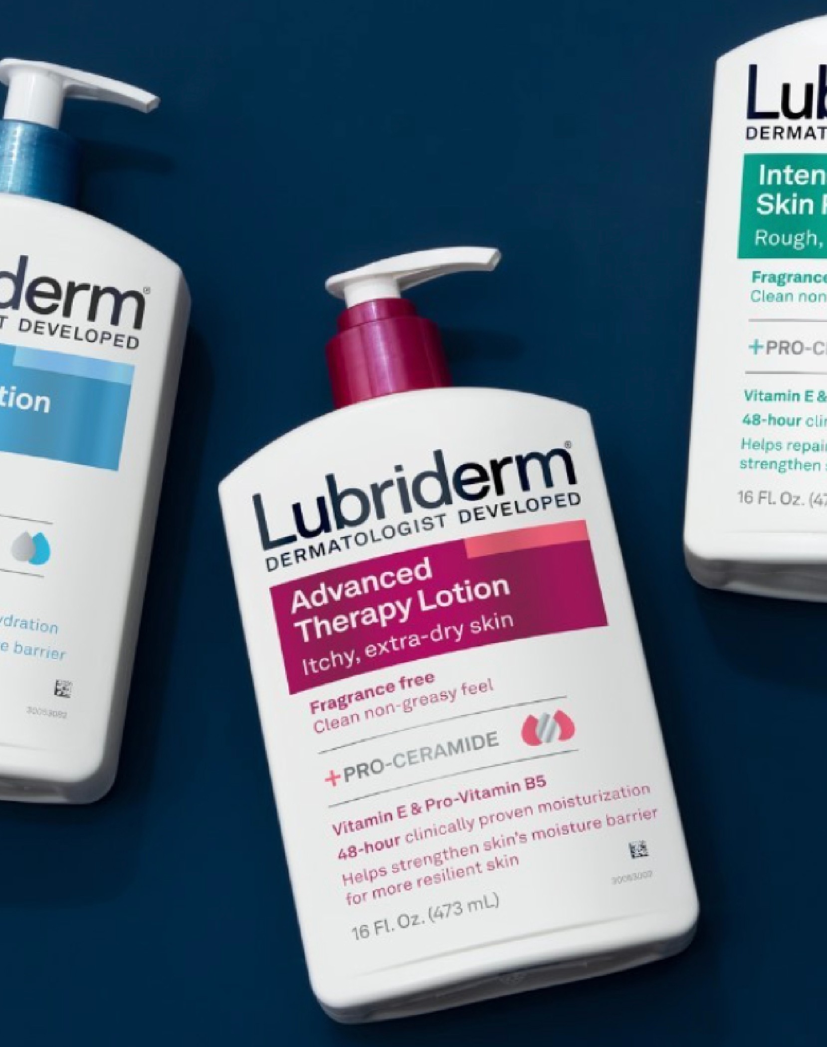
Essential Navy became the brand's signature colour. Design stepped back to let imagery lead — large-scale photography of people, skin, product, and ingredients. Headlines minimal. Body copy minimal. Enough infrastructure, no more. The hero—the beauty of healthy skin.


APPLICATION
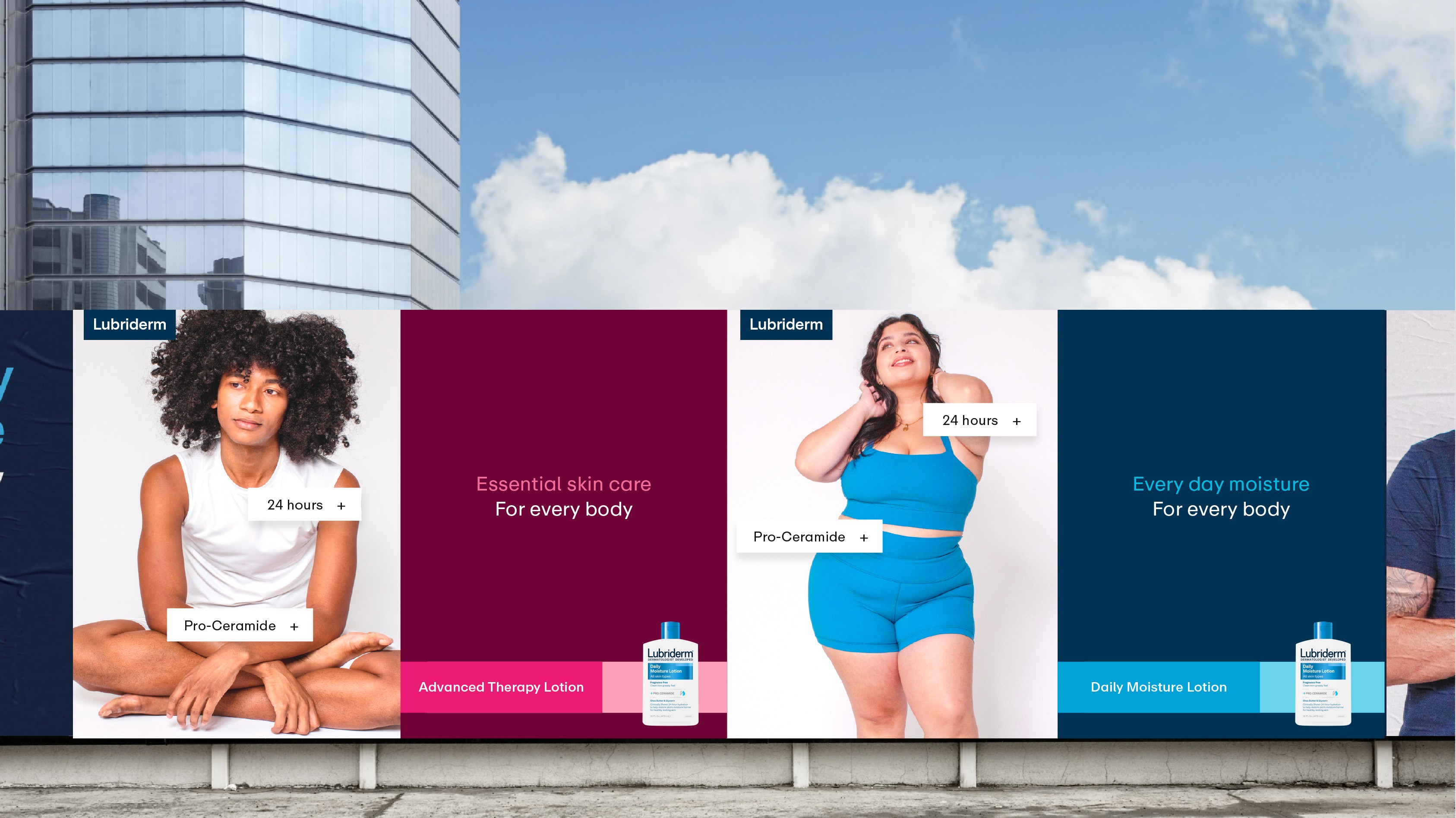
Built around real stories, real bodies, real skin. A consistent brand and colour story stretched across product formats to create a coherent brand world — one that reflects the magnificent diversity of the people who've always trusted it.


OUTCOME
The refresh gave Lubriderm back its voice. No longer speaking to a narrow slice of its audience, the brand now shows up as what it's always been: a trusted, therapeutic staple with a personality to match. Essential — for everyone.
Johnson & JohnsonSenior Brand Designer & Creative DirectorIn close collaboration with Sofia Sorvino, Brand Design Lead


🍒
Lubriderm Life-Tested. Essential.
Brand Identity, Design System, PACKAGING, eComm, Digital, SOCIAL
overview
Lubriderm is a classic. Nearly everyone in the US has a connection with the brand. Bathroom cabinets. Car dashboards. Hospital dispensers. Tattoo studios. A household staple since 1975, Lubriderm earned its place through a dermatologically developed formula trusted across all skin types — and kept it for decades without advertising.
A classic. And one that hadn't been updated in nearly twenty years.
CHALLENGE
The brand's assets no longer reflected who actually used it. Airbrushed. Narrow. A design language that spoke to a fraction of the people it served. With no visual system, no social presence, and no way to show up coherently across modern touchpoints, Lubriderm needed more than a refresh — it needed a full brand build.
The brief: define the brand foundation and build assets that celebrate people of all shapes, sizes, and skin types.
STRATEGY
Lubriderm is an essential product, recommended for daily use. Not aspirational. Not transformational. Essential. So the strategy was simple: show skin — clean, real, everyday — in the myriad of ways Lubriderm actually shows up in life.
Simple. Classic. Consistent. Useful.
IDENTITY
Designing for the essentialist means using only what's necessary. No fluff, no filler. Just people at the heart of the brand, and just enough structure to carry the benefits.
Essential Navy became the brand's signature colour. Design stepped back to let imagery lead — large-scale photography of people, skin, product, and ingredients. Headlines minimal. Body copy minimal. Enough infrastructure, no more. The hero—the beauty of healthy skin.
APPLICATION
Built around real stories, real bodies, real skin. A consistent brand and colour story stretched across product formats to create a coherent brand world — one that reflects the magnificent diversity of the people who've always trusted it.
OUTCOME
The refresh gave Lubriderm back its voice. No longer speaking to a narrow slice of its audience, the brand now shows up as what it's always been: a trusted, therapeutic staple with a personality to match. Essential — for everyone.
Johnson & JohnsonSenior Brand Designer & Creative DirectorIn close collaboration with Sofia Sorvino, Brand Design Lead


