
Brand & CPG Design
Work
About
Approach
Work with me

→
Nicorette®Global Brand Identity Refresh
Identity
Art Direction
Design Systems
Nicorette invented the category and today leads 80 markets.
Over four decades of recognition as the go-to brand to help you quit.
The refresh keeps what people know and trust, while enhancing the flexibility of the brand’s communication ecosystem.
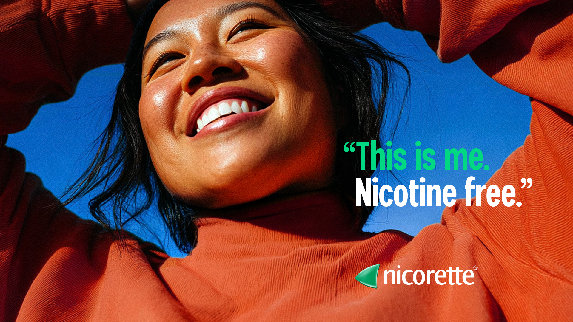
Quitting isn't a transaction. It's a personal, sustained, and challenging act of will. So Nicorette shows up as a partner, not a prescription.
Cultural Moment
Nicotine has evolved past smoking — new generations are hooked without ever lighting up.
client brief
Create a unified system of brand assets at the global level capturing the optimistic nature of Nicorette.
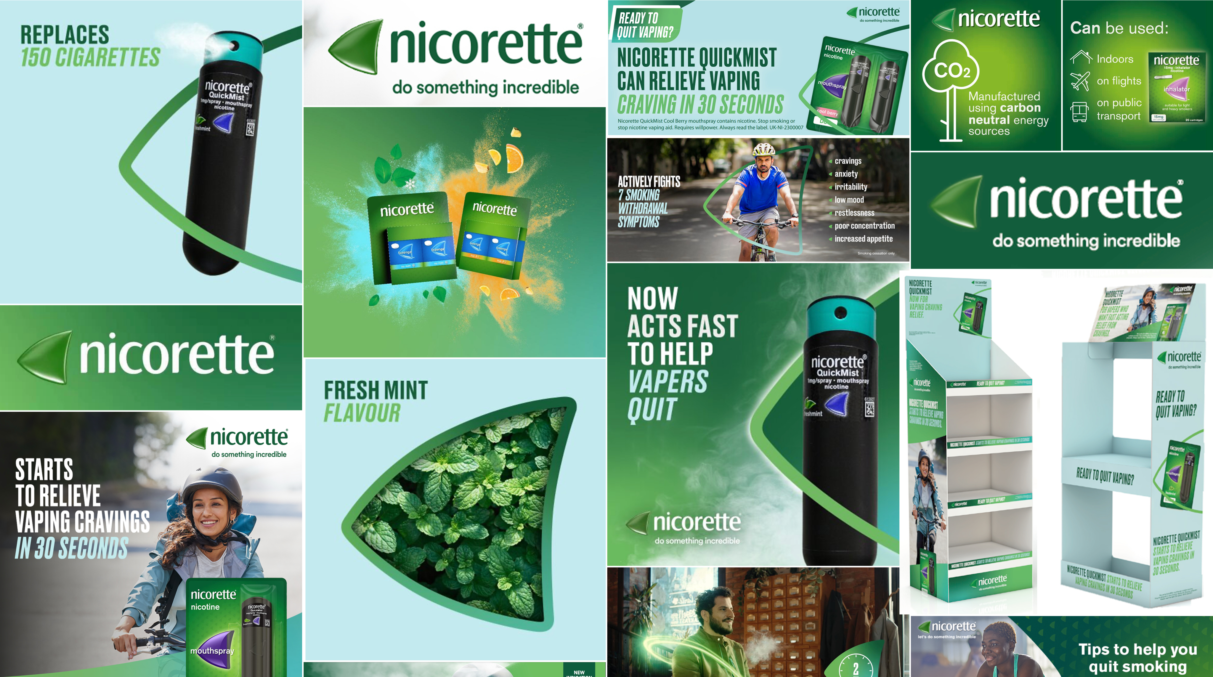
Before. Previous brand ID. Every market solving contrast, color, layout, and proportion on its own.
The existing system wasn’t working in application and markets addressed problems at the local level. The result was fractured, and costly.
Logo
Lacked contrast, especially on green.
color
Shifting between light blue solid (for contrast) and green gradient
Type
Uppercase, condensed and difficult to read at a glance
Art direction
Flavor expressed in various ways. Lifestyle imagery lacks cohesion and dis.
Design system
Missing rules for contrast, scale, and proportion. Outdated file formats. Core brand assets created and shared locally.
Previous brand ID. Core brand asset variations and inconsistencies.
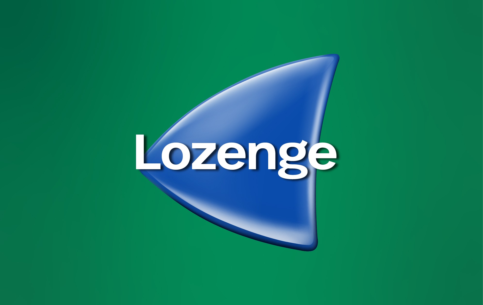
The green Spinnaker is the most recognized mark in the category. The glow up keeps the silhouette while amplifying the visibility.
Before. Pixels, with low contrast. A fix for every market.
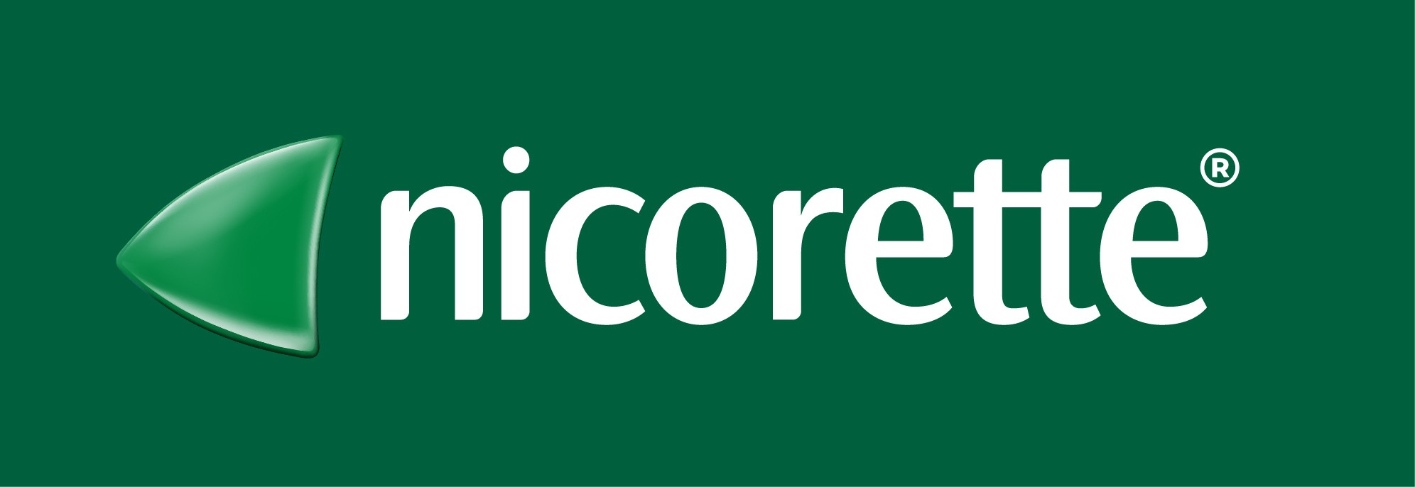
After. Vector, with light and shadow built into the shape
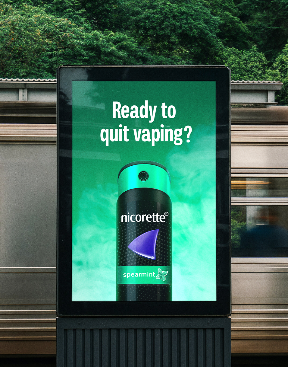
Nicorette owns green on shelf. Now brand communications compliment. A saturated palette with Evergreen, a signature green hue. And Aura, an optimistic glow.

Before. Three greens, no center.

After. Evergreen. Aura. A fluid green palette.
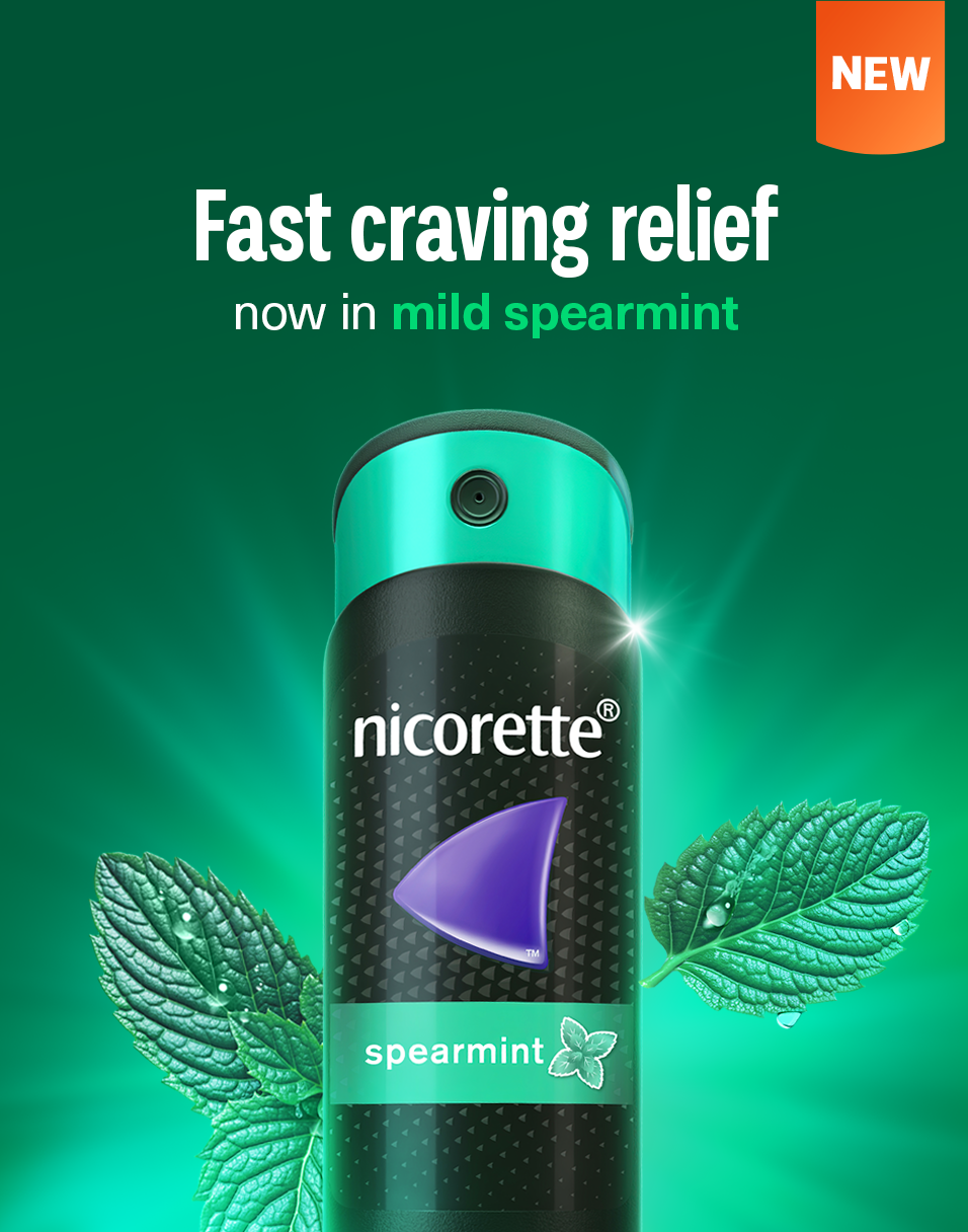
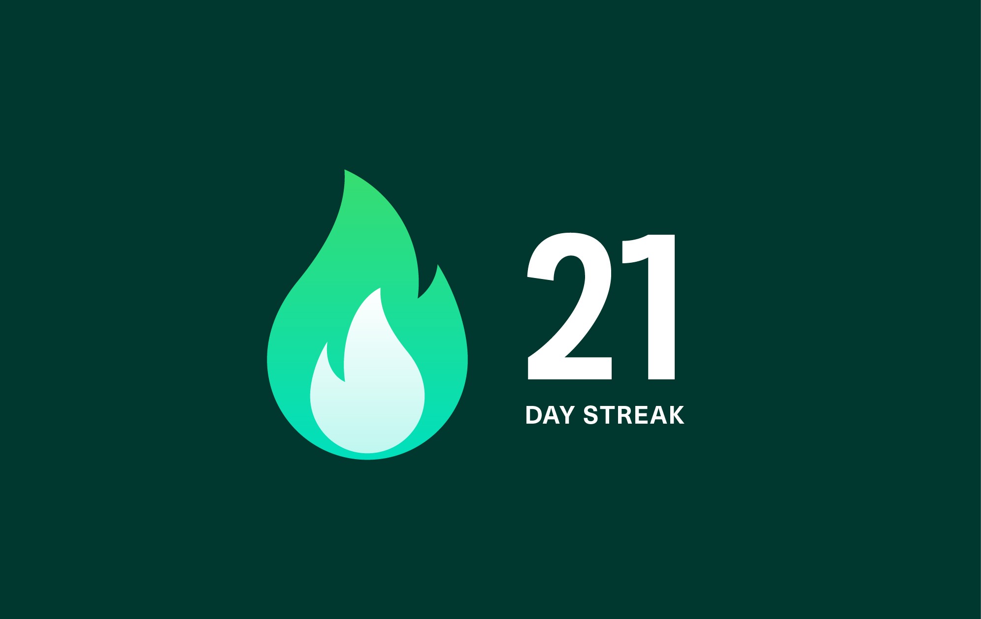

Messaging is softened with unique, friendly, and slightly imperfect Palo.
Neue Haas Unica balances with precision for details.
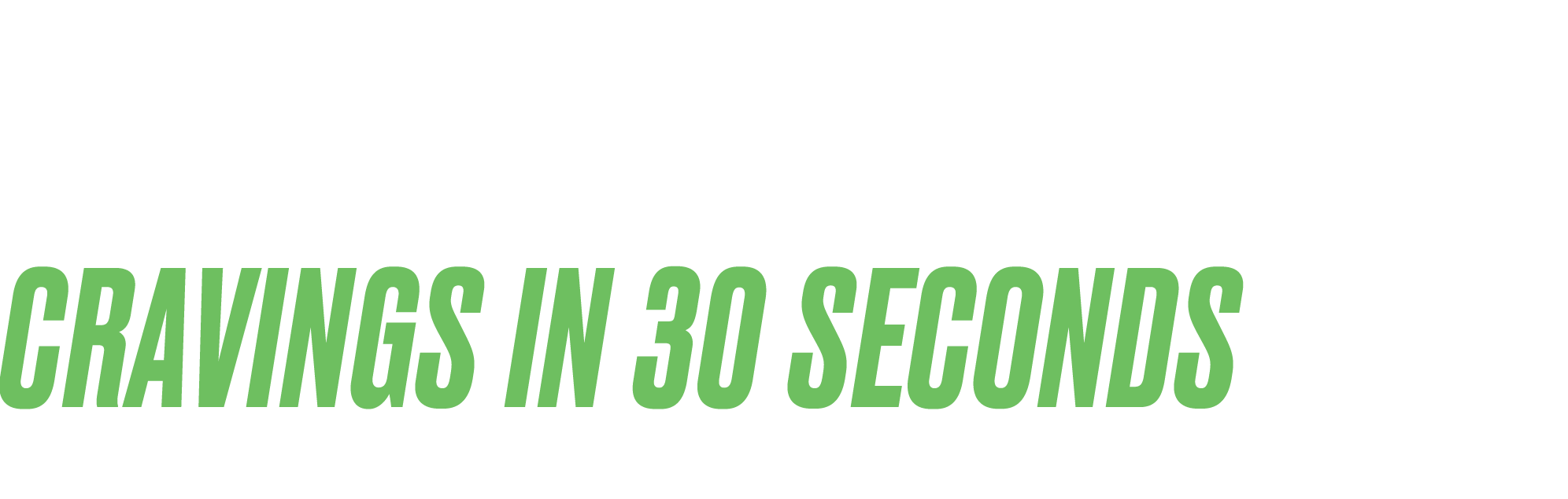
Before. Caps, italic, condensed.

After. Down to earth, friendly, legible.
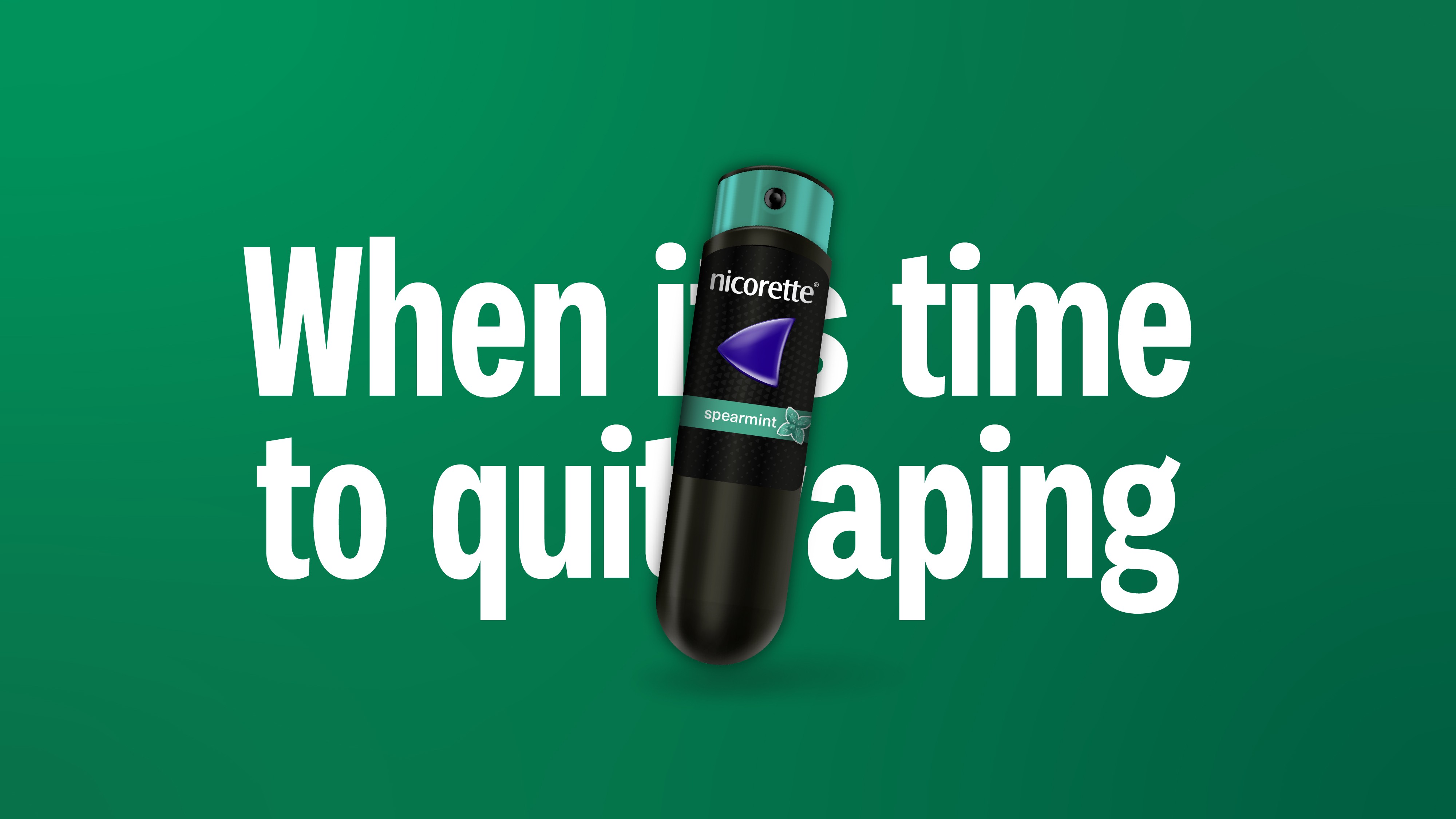
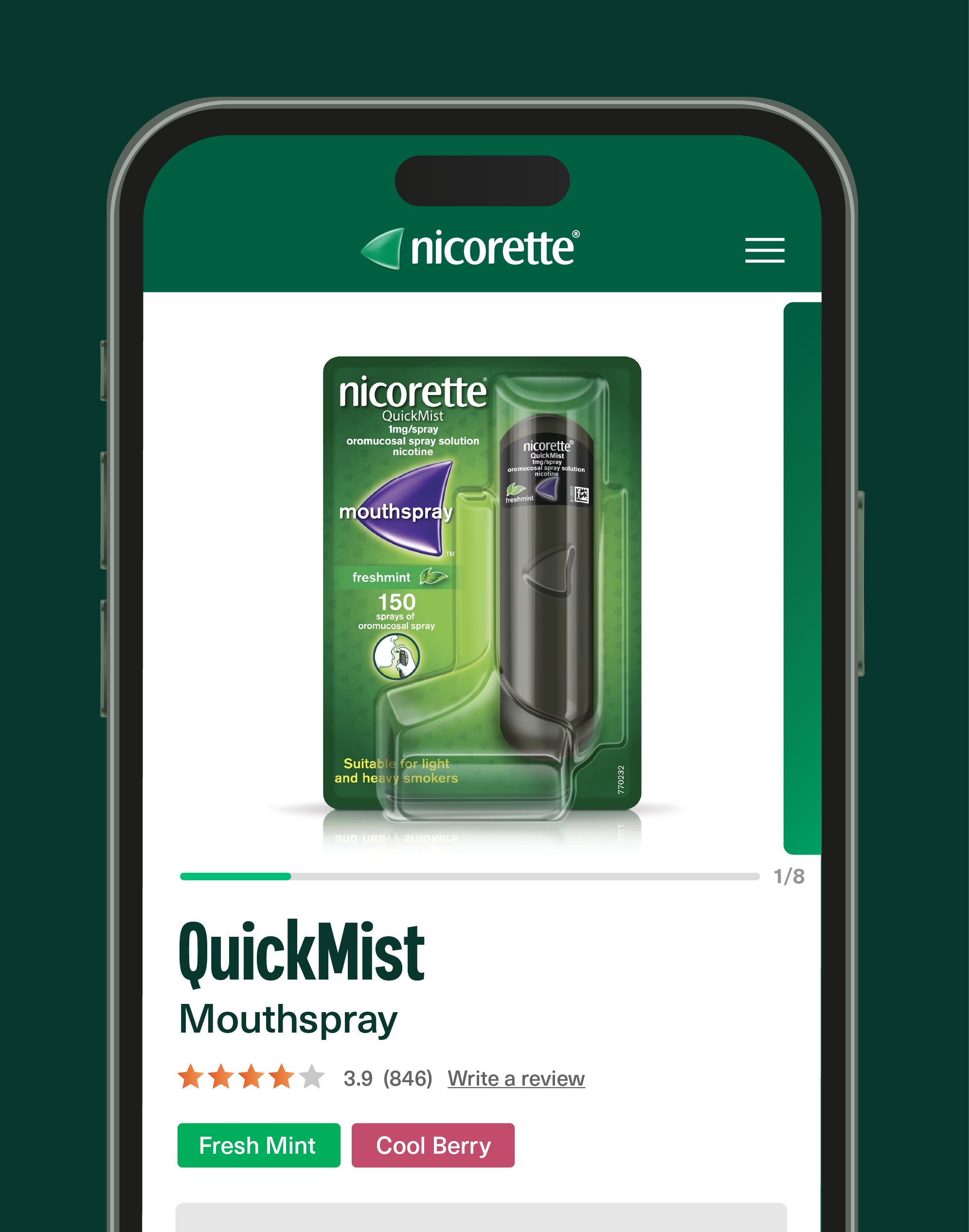
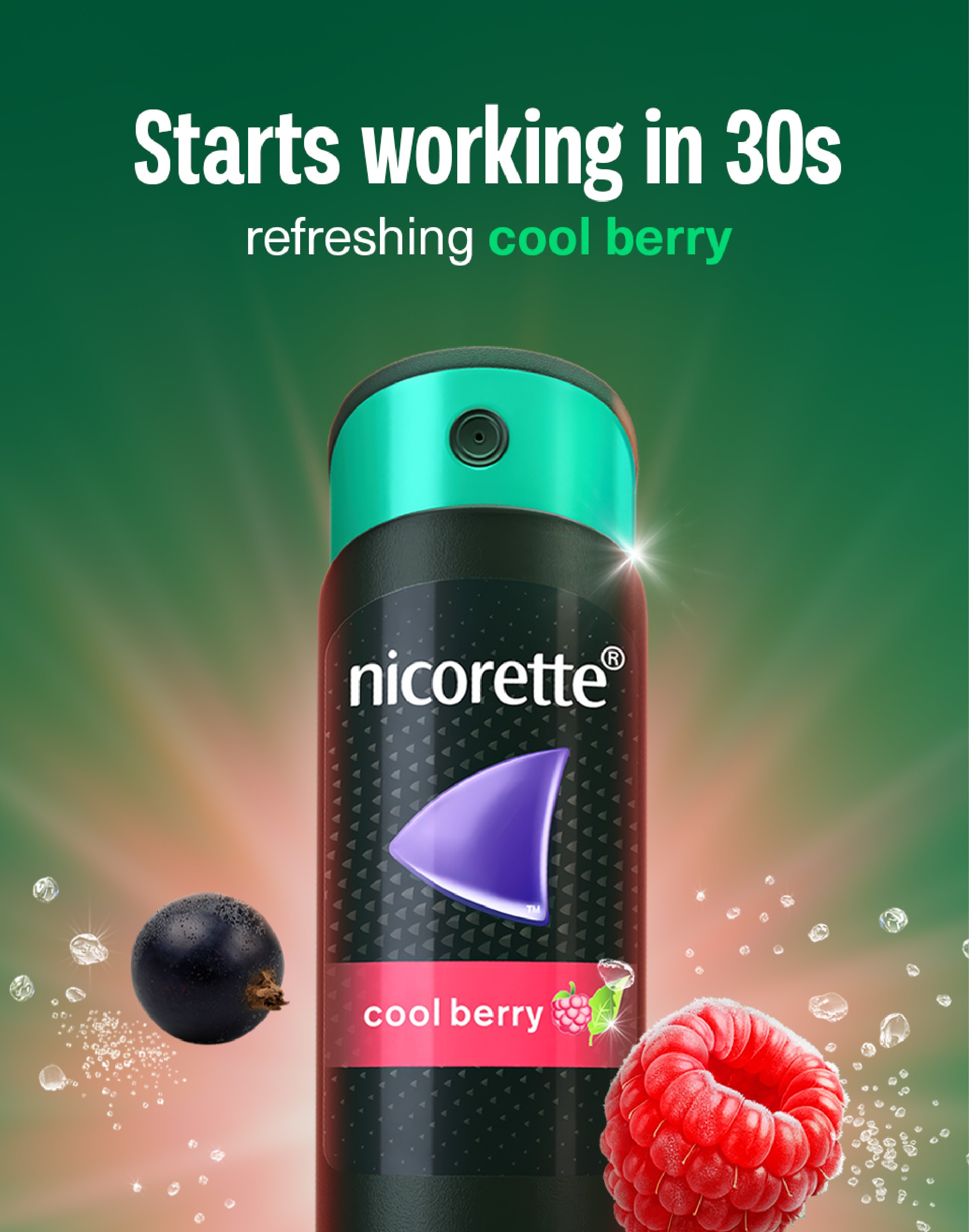
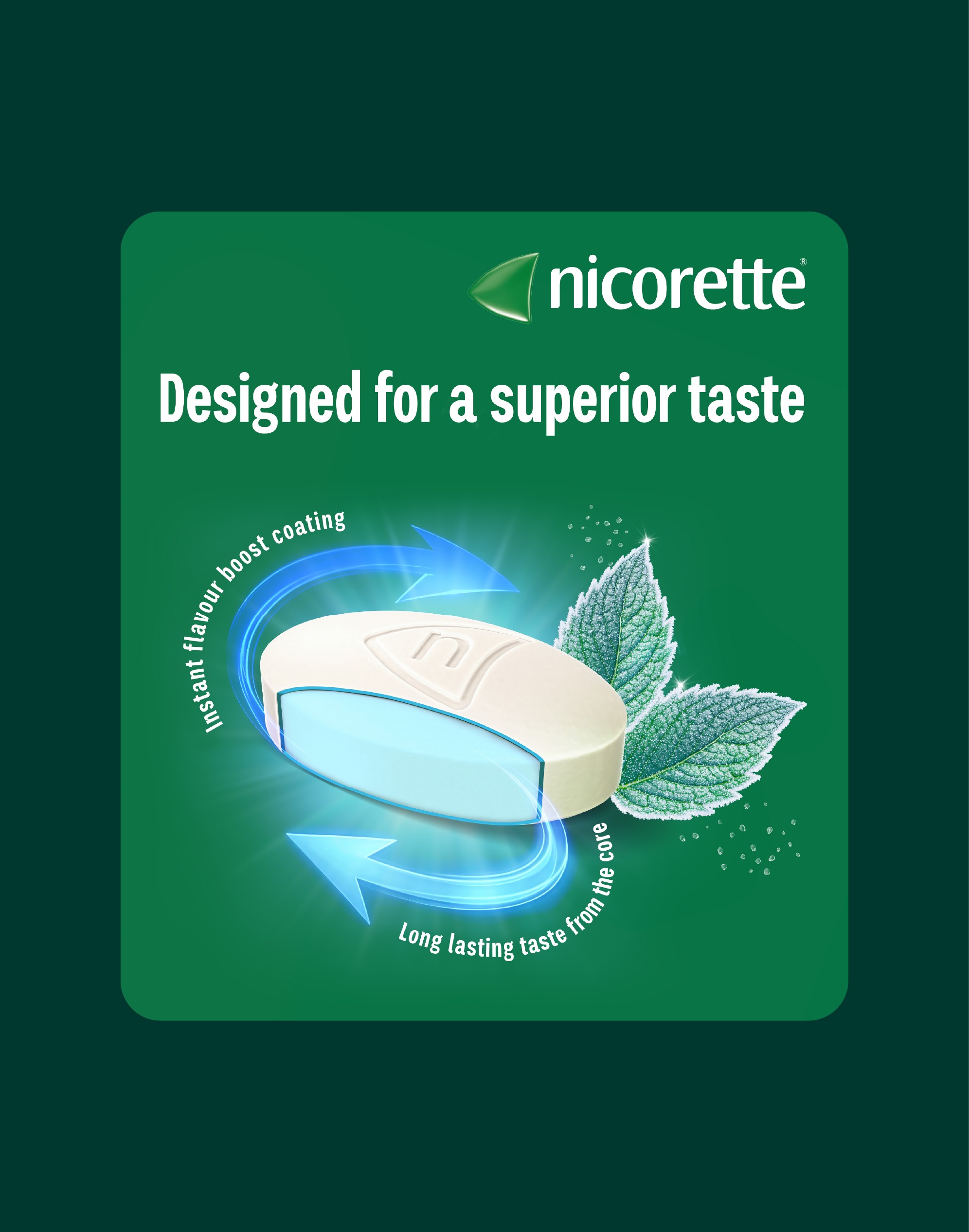
Fresh fruits and mints at actual size pique senses and highlight discreet product sizes.
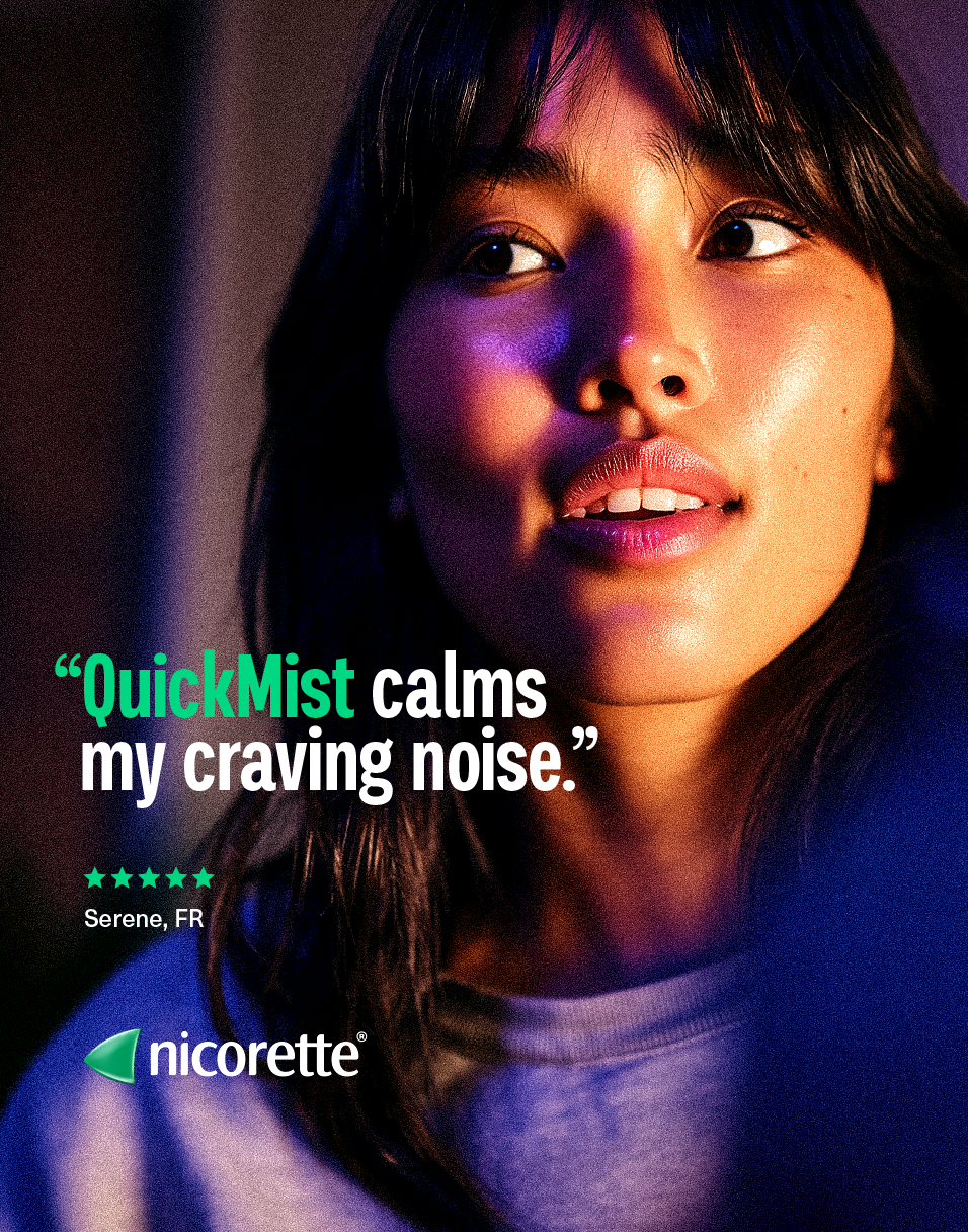
Imagery rich in color, intimately cropped, subject illuminated. A glimpse at the inner strength of real people, mid-quit.
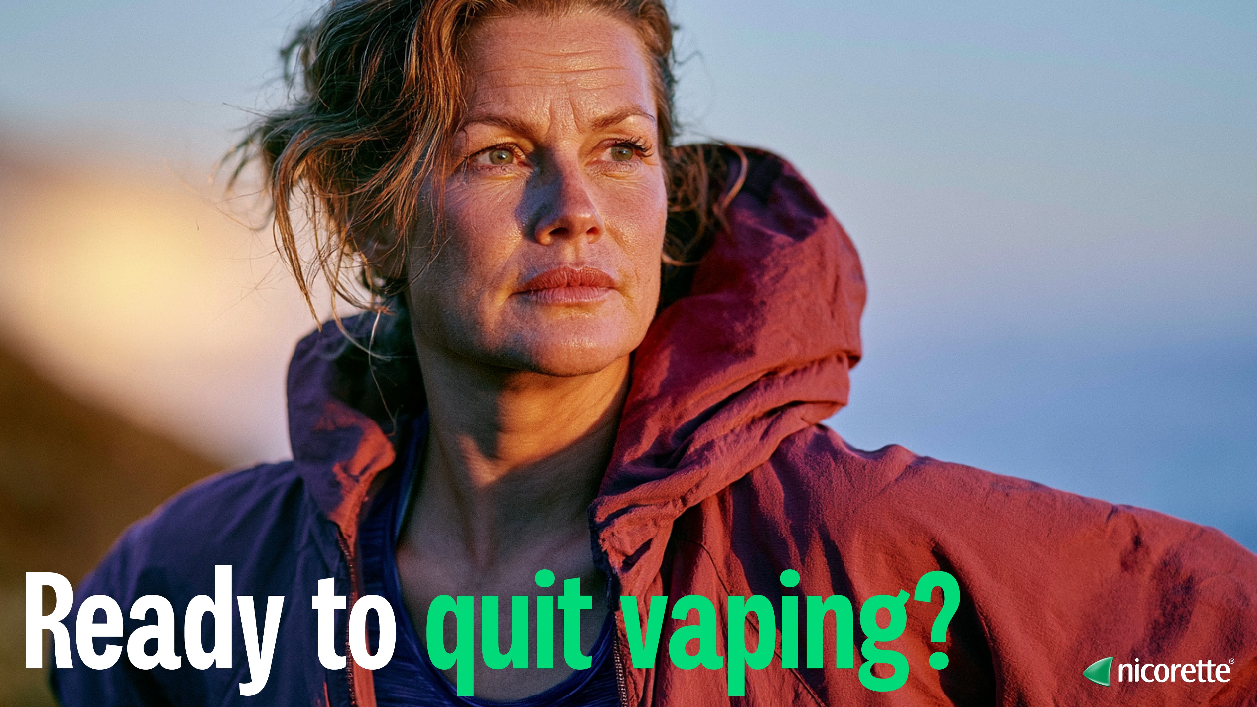
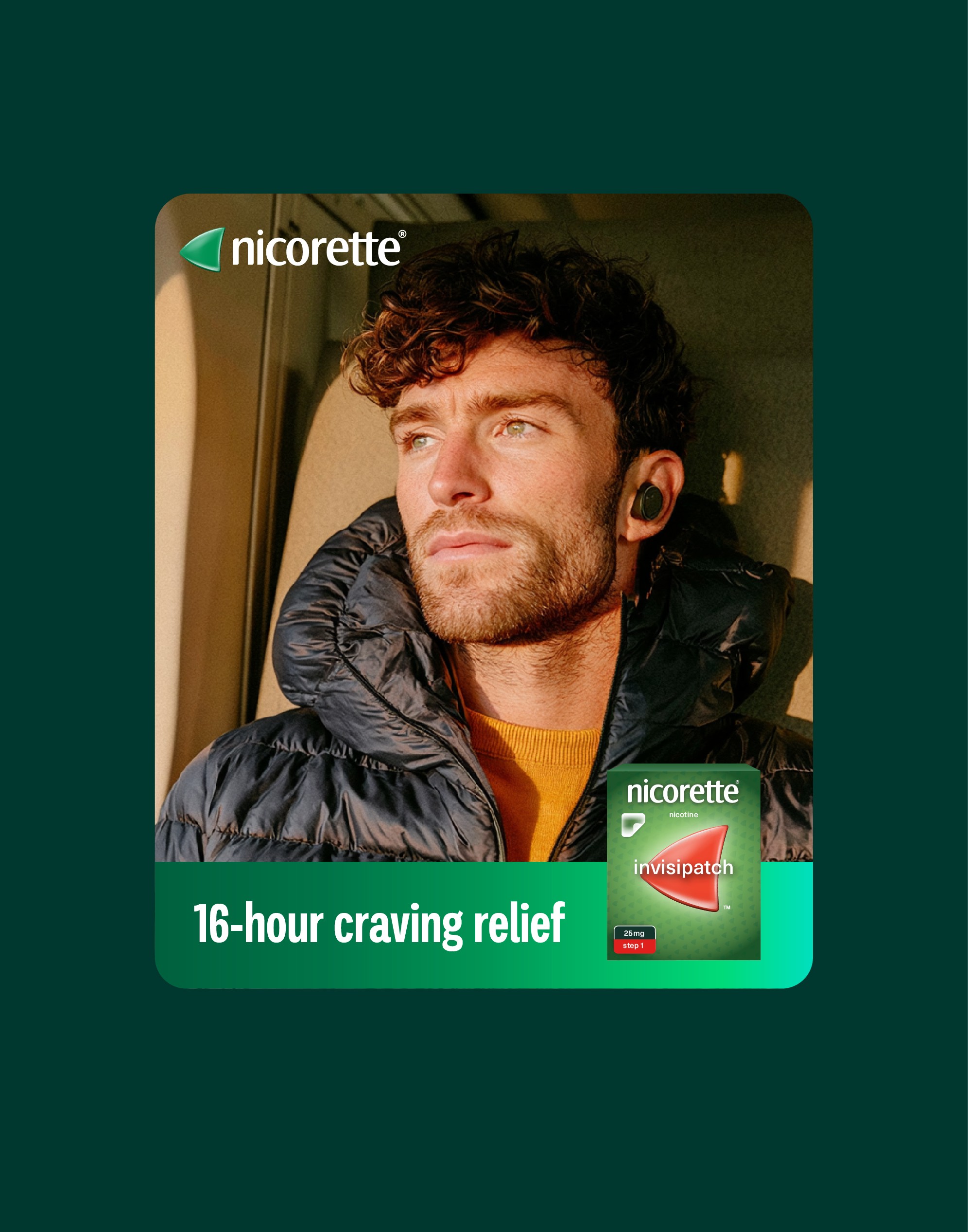
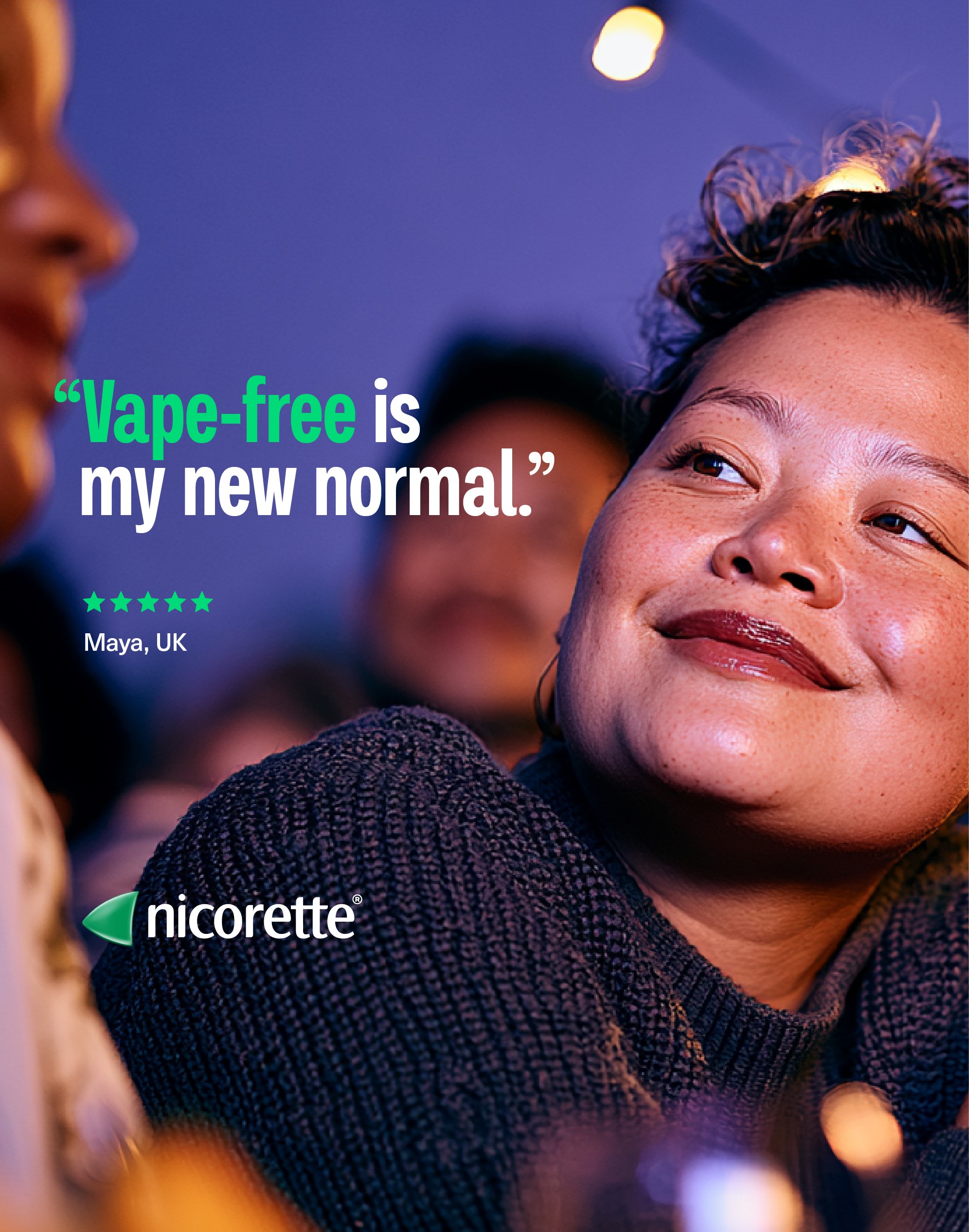
Photography direction. Frames generated to brief ahead of production.
One language, spoken everywhere. Clinical rigor, expressed with warmth.
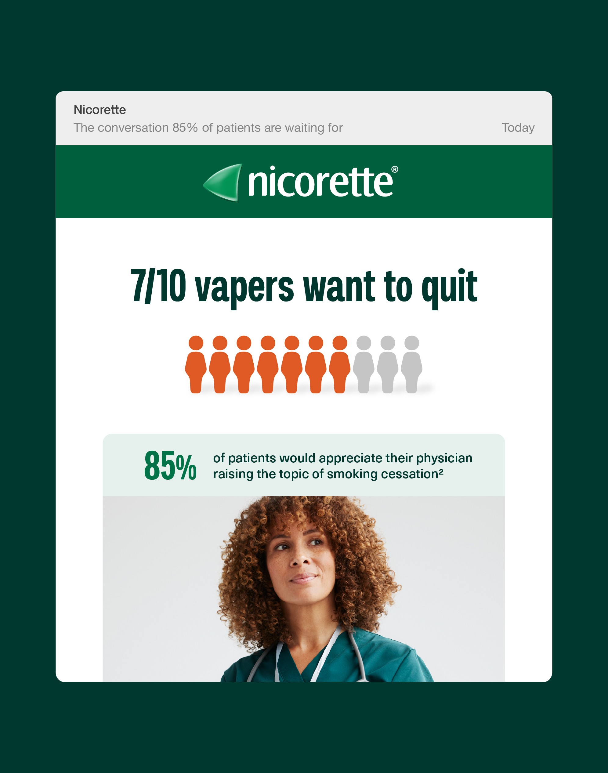
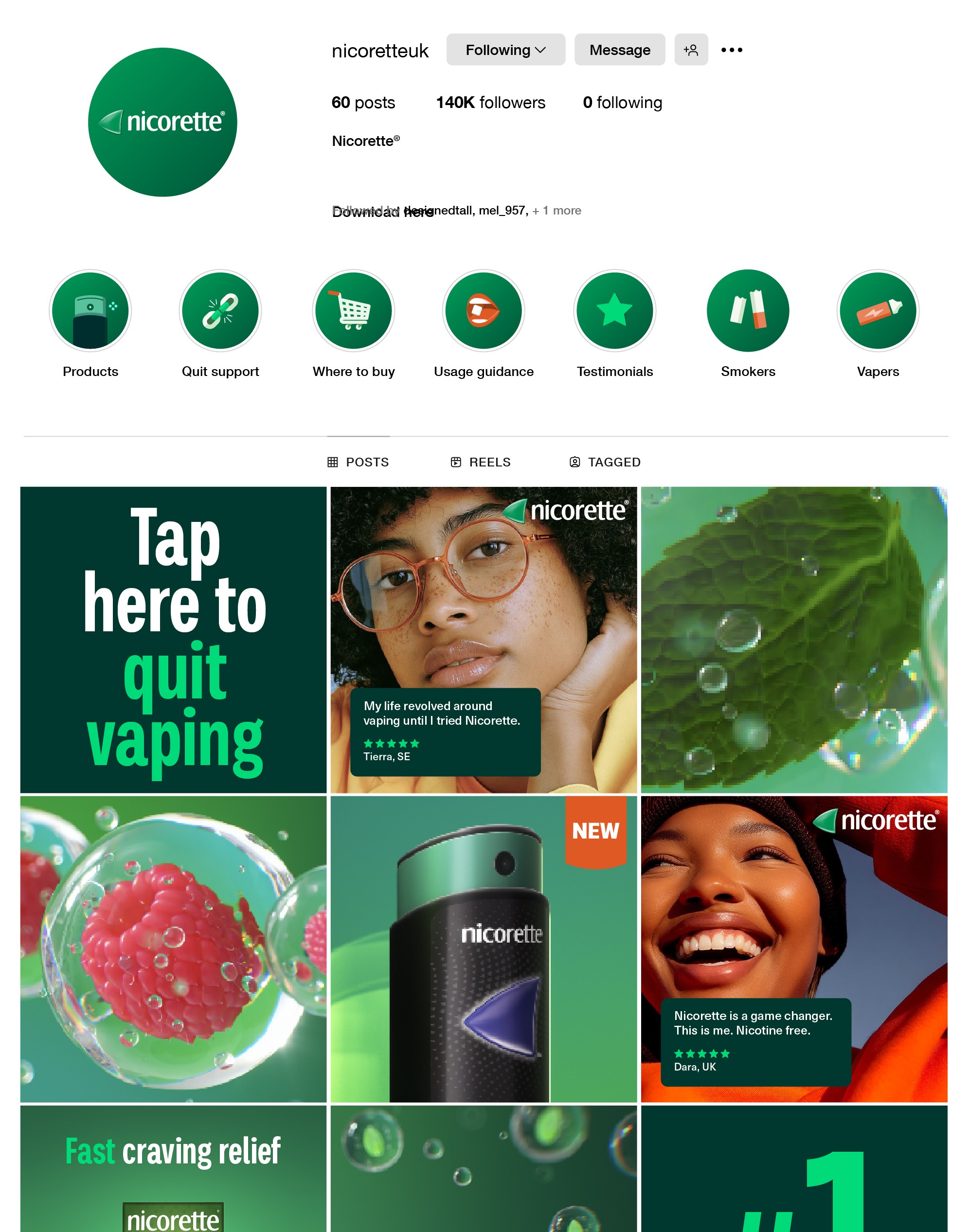
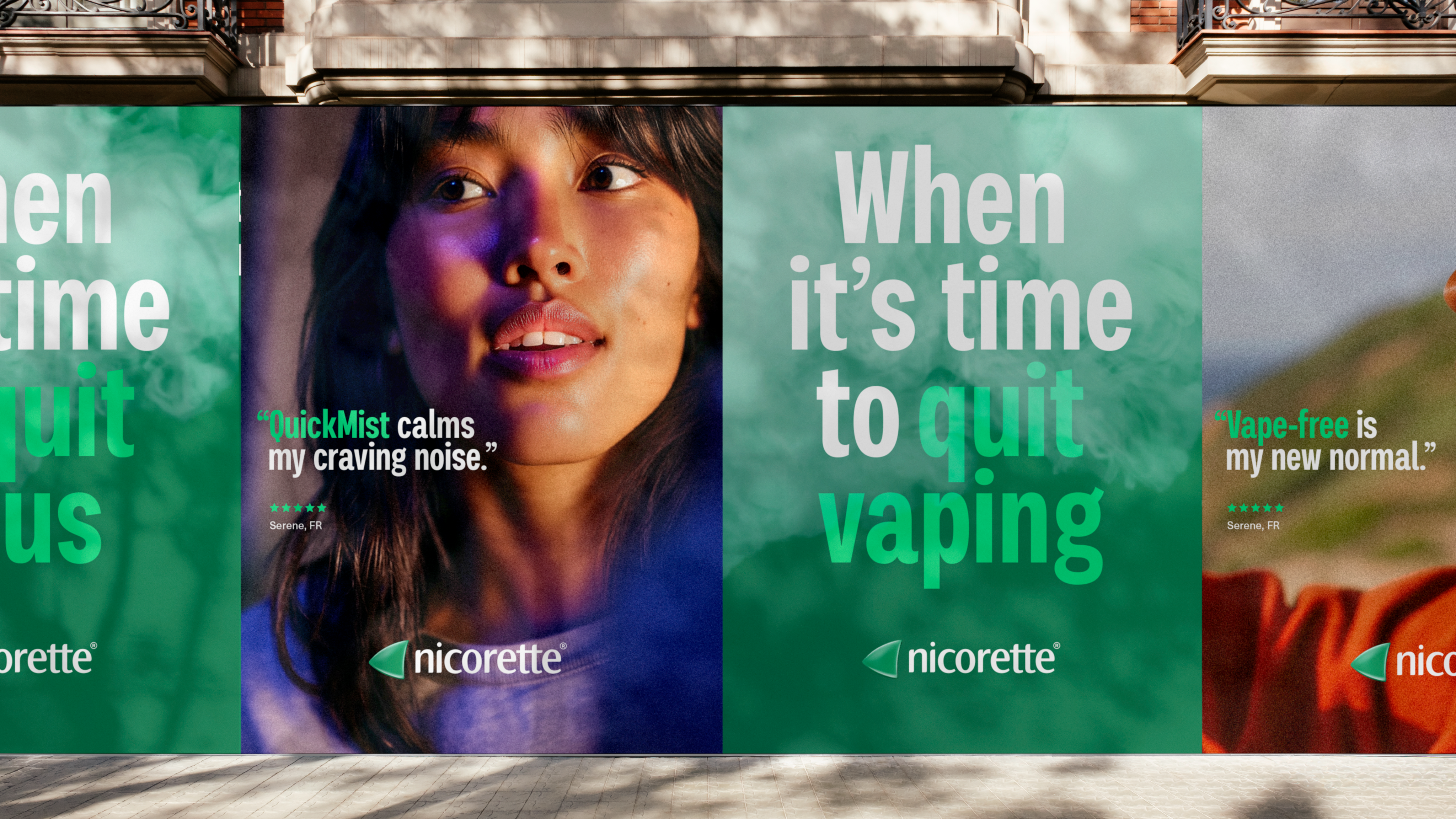
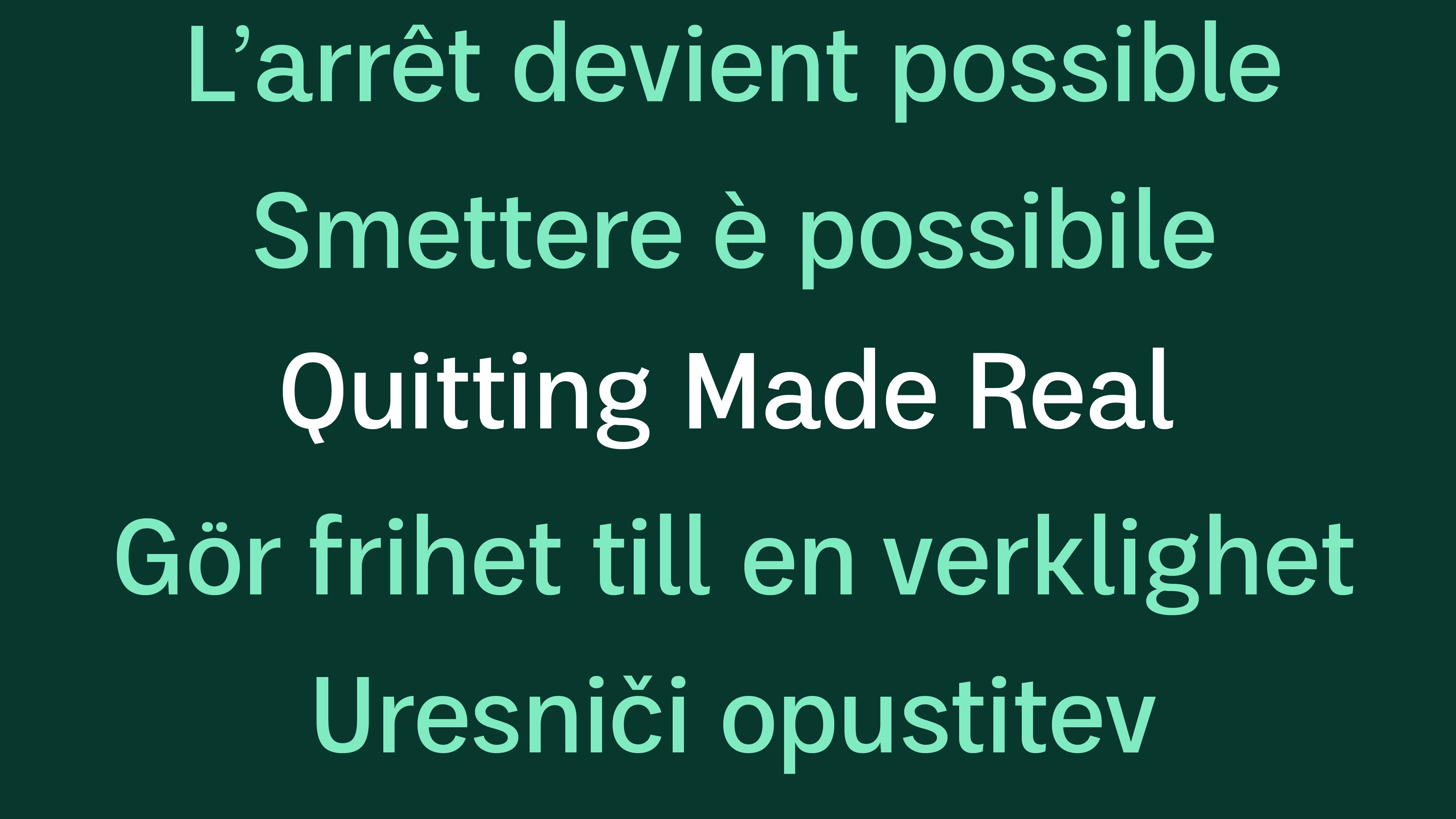
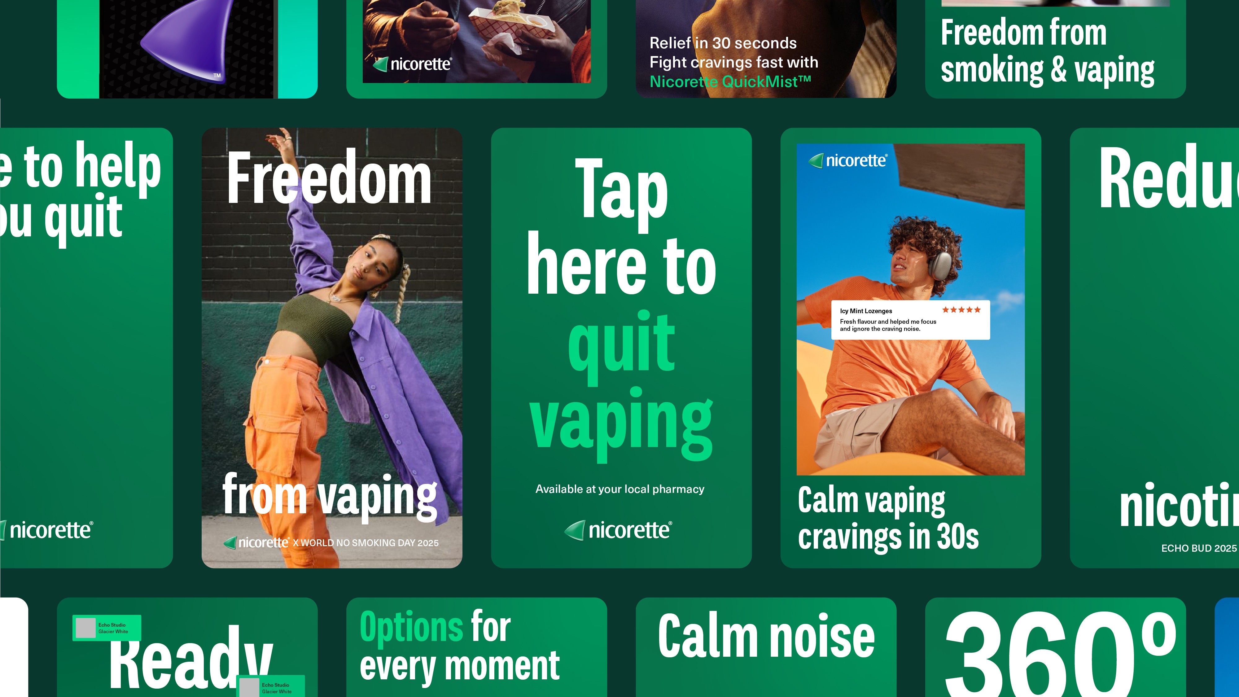
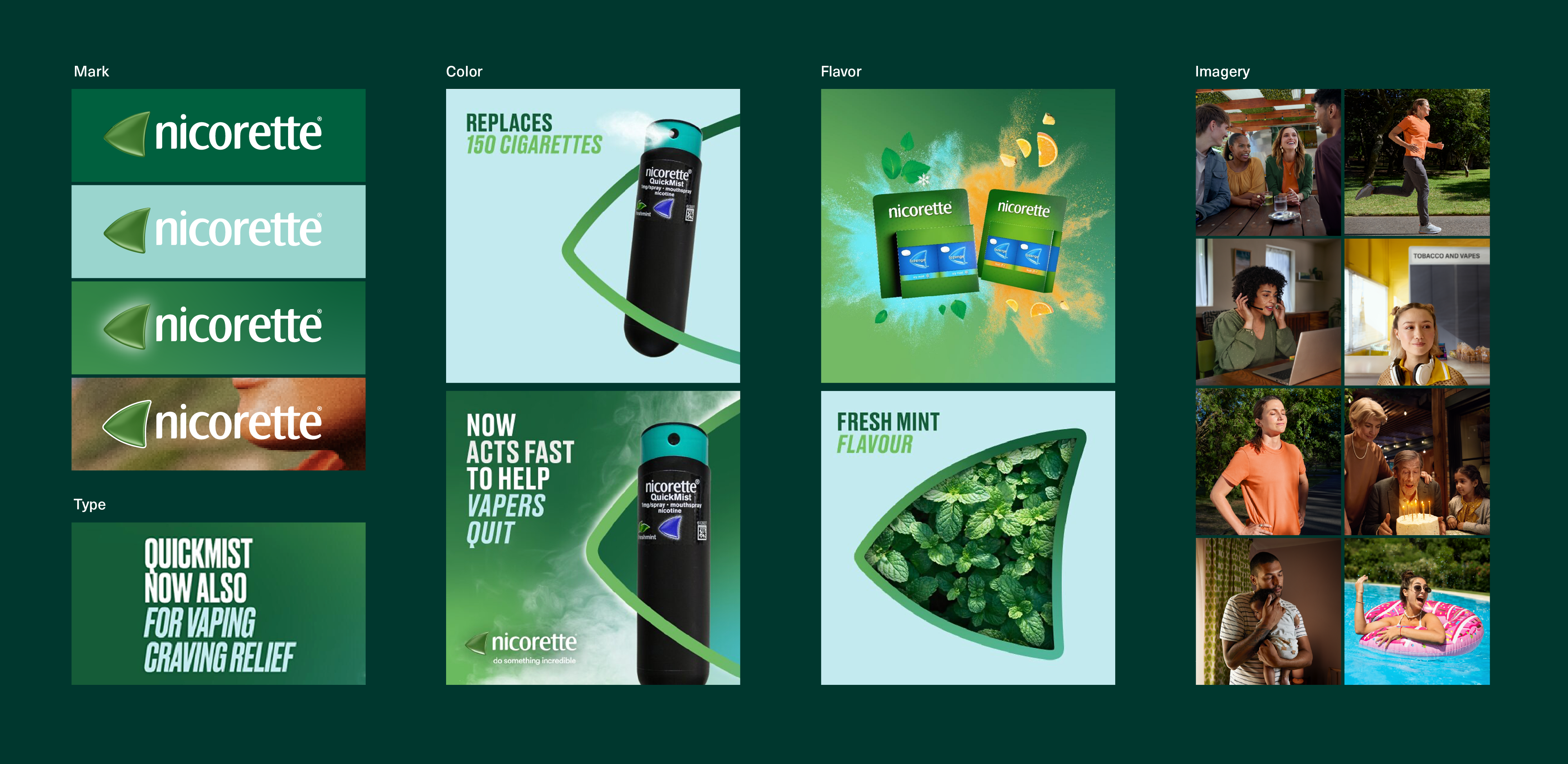
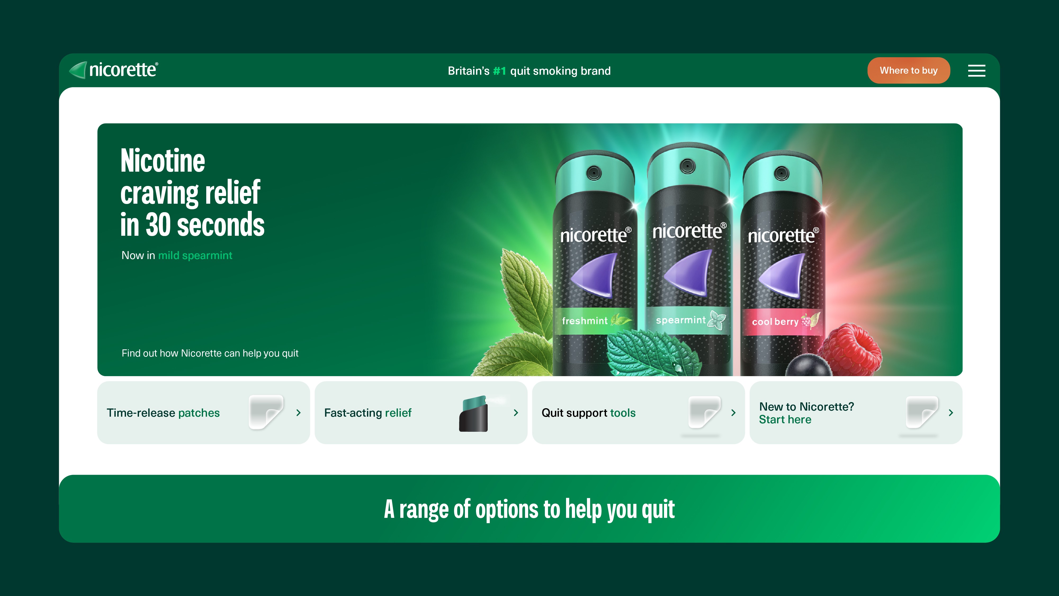
One system, 80 markets. Built once, adaptable locally, recognizable everywhere.
Quitting made real.
KenvueGlobal Brand Design LeadIn close collaboration with the Nicorette brand team
View next
Versalie Digital-First Brand System
Laforet Sensorial Brand Identity
Lubriderm Legacy Brand Modernization

Substack
Brand & CPG Design
Work
About
Approach
Work with me
→
Nicorette®Global Brand Identity Refresh
Identity
Art Direction
Design Systems
Nicorette invented the category and today leads 80 markets.
Over four decades of recognition as the go-to brand to help you quit.
The refresh keeps what people know and trust, while enhancing the flexibility of the brand’s communication ecosystem.
Quitting isn't a transaction. It's a personal, sustained, and challenging act of will. So Nicorette shows up as a partner, not a prescription.
Cultural Moment
Nicotine has evolved past smoking — new generations are hooked without ever lighting up.
client brief
Create a unified system of brand assets at the global level capturing the optimistic nature of Nicorette.
Before. Previous brand ID. Every market solving contrast, color, layout, and proportion on its own.
The existing system wasn’t working in application and markets addressed problems at the local level. The result was fractured, and costly.
Logo
Lacked contrast, especially on green.
color
Shifting between light blue solid (for contrast) and green gradient
Type
Uppercase, condensed and difficult to read at a glance
Art direction
Flavor expressed in various ways. Lifestyle imagery lacks cohesion and dis.
Design system
Missing rules for contrast, scale, and proportion. Outdated file formats. Core brand assets created and shared locally.
Previous brand ID. Core brand asset variations and inconsistencies.
The green Spinnaker is the most recognized mark in the category. The glow up keeps the silhouette while amplifying the visibility.
Before. Pixels, with low contrast. A fix for every market.
After. Vector, with light and shadow built into the shape
Nicorette owns green on shelf. Now brand communications compliment. A saturated palette with Evergreen, a signature green hue. And Aura, an optimistic glow.
Before. Three greens, no center.
After. Evergreen. Aura. A fluid green palette.
Messaging is softened with unique, friendly, and slightly imperfect Palo.
Neue Haas Unica balances with precision for details.
Before. Caps, italic, condensed.
After. Down to earth, friendly, legible.
Fresh fruits and mints at actual size pique senses and highlight discreet product sizes.
Imagery rich in color, intimately cropped, subject illuminated. A glimpse at the inner strength of real people, mid-quit.
Photography direction. Frames generated to brief ahead of production.
One language, spoken everywhere. Clinical rigor, expressed with warmth.
One system, 80 markets. Built once, adaptable locally, recognizable everywhere.
Quitting made real.
KenvueGlobal Brand Design LeadIn close collaboration with the Nicorette brand team
View next
Versalie Digital-First Brand System
Laforet Sensorial Brand Identity
Lubriderm Legacy Brand Modernization

Substack
Brand & CPG Design
Work
About
Approach
Work with me
→
Nicorette®Global Brand Identity Refresh
Identity
Art Direction
Design Systems
Nicorette invented the category and today leads 80 markets.
Over four decades of recognition as the go-to brand to help you quit.
The refresh keeps what people know and trust, while enhancing the flexibility of the brand’s communication ecosystem.
Quitting isn't a transaction. It's a personal, sustained, and challenging act of will. So Nicorette shows up as a partner, not a prescription.
Cultural Moment
Nicotine has evolved past smoking — new generations are hooked without ever lighting up.
client brief
Create a unified system of brand assets at the global level capturing the optimistic nature of Nicorette.
Before. Previous brand ID. Every market solving contrast, color, layout, and proportion on its own.
The existing system wasn’t working in application and markets addressed problems at the local level. The result was fractured, and costly.
Logo
Lacked contrast, especially on green.
color
Shifting between light blue solid (for contrast) and green gradient
Type
Uppercase, condensed and difficult to read at a glance
Art direction
Flavor expressed in various ways. Lifestyle imagery lacks cohesion and dis.
Design system
Missing rules for contrast, scale, and proportion. Outdated file formats. Core brand assets created and shared locally.
Before. Core brand asset variations and inconsistencies.
The green Spinnaker is the most recognized mark in the category. The glow up keeps the silhouette while amplifying the visibility.
Before. Pixels, with low contrast. A fix for every market.
After. Vector, with light and shadow built into the shape
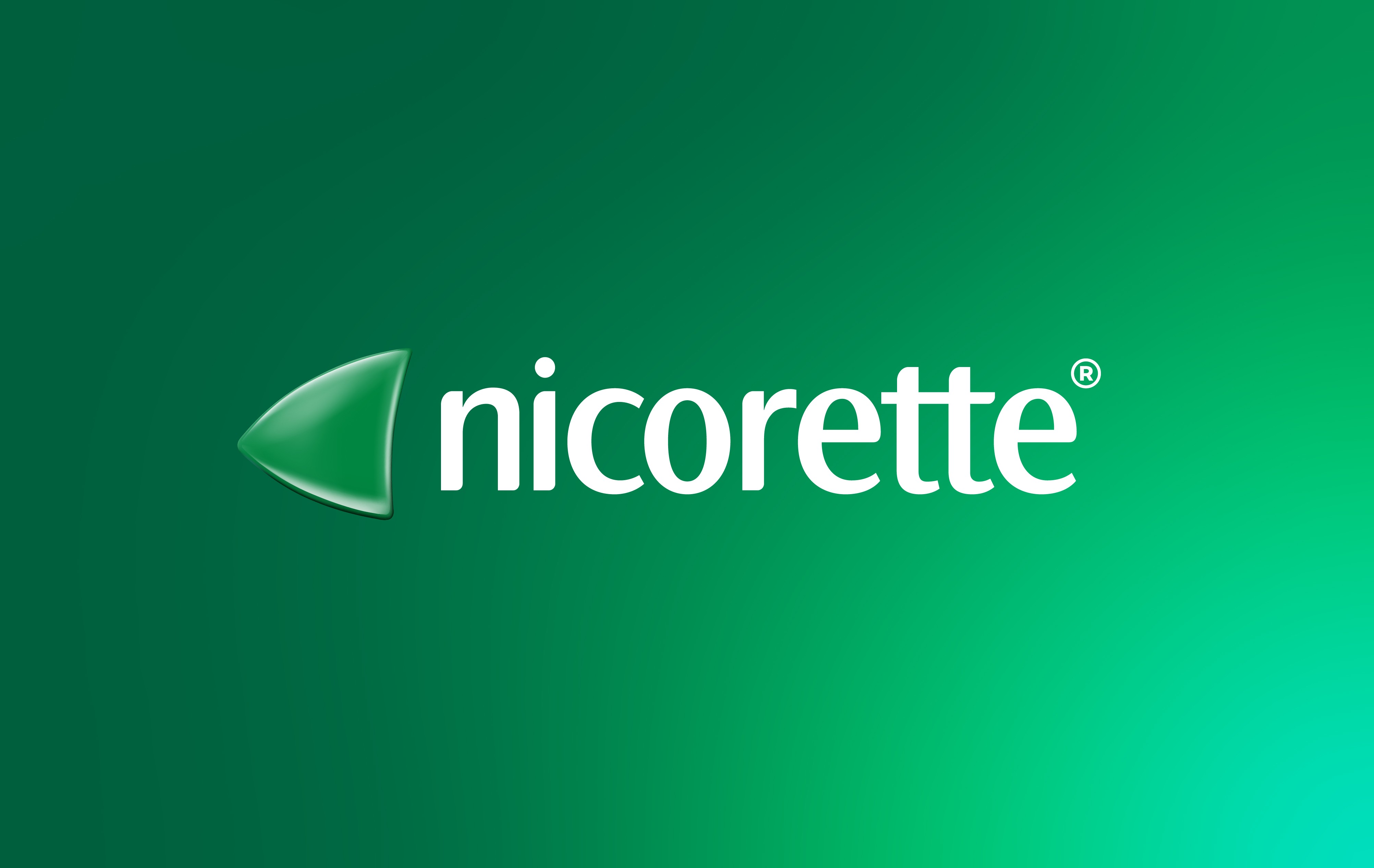
Nicorette owns green on shelf. Now brand communications compliment. A saturated palette with Evergreen, a signature green hue. And Aura, an optimistic glow.
Before. Three greens, no center.
After. Evergreen. Aura. A fluid green palette.
Messaging is softened with unique, friendly, and slightly imperfect Palo.
Neue Haas Unica balances with precision for details.
Before. Caps, italic, condensed.
After. Down to earth, friendly, legible.
Fresh fruits and mints at actual size pique senses and highlight discreet product sizes.
Imagery rich in color, intimately cropped, subject illuminated. A glimpse at the inner strength of real people, mid-quit.
Photography direction. Frames generated to brief ahead of production.
One language, spoken everywhere. Clinical rigor, expressed with warmth.
One system, 80 markets. Built once, adaptable locally, recognizable everywhere.
Quitting made real.
KenvueGlobal Brand Design LeadIn close collaboration with the Nicorette brand team
View next
Versalie Digital-First Brand System
Laforet Sensorial Brand Identity
Lubriderm Legacy Brand Modernization

Substack